Product Page Quick Info
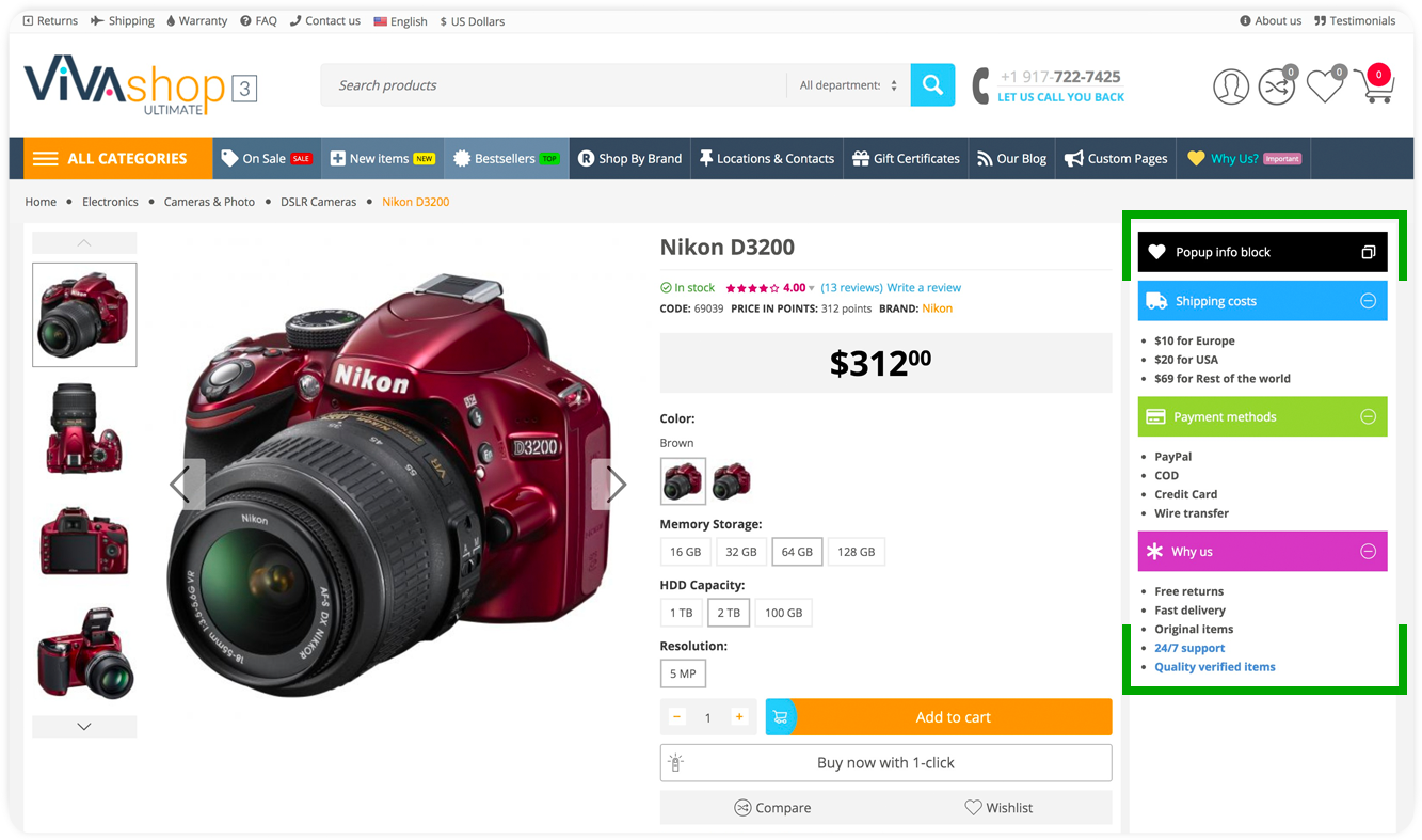
The “Product Page Quick Info” add-on allows you to add unlimited number of customizable blocks with quick important and catchy information on the right side of the product page. You can add any custom HTML in these custom blocks, and you can choose to open their content either in a pop-up window or in a dropdown. For Multi-Vendor users please note that each Vendor has the possiblity to add their own information in these blocks that you create for your Marketplace. However, Vendors cannot create such blocks, they can only add their own content it the “Product Page Quick Info” blocks pre-created by you. Each Vendor will have his own custom information in the “Product Page Quick Info” blocks on their product pages. For more information please refer to the “Advanced Multi-Vendor” add-on.
Please follow the steps below in order to learn how to create and customize a Product Page Quick Info block. NOTE: The demo blocks from our demo site will automatically be installed if you have closen to install the demo content under section “Installing demo data”
- Step 1
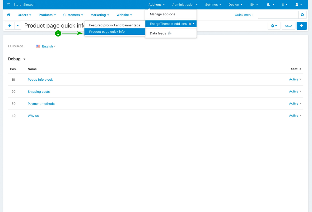
In your admin panel, go to “Add-ons” - “EnergoThemes Add-ons” - “Product page quick info”
- Step 2
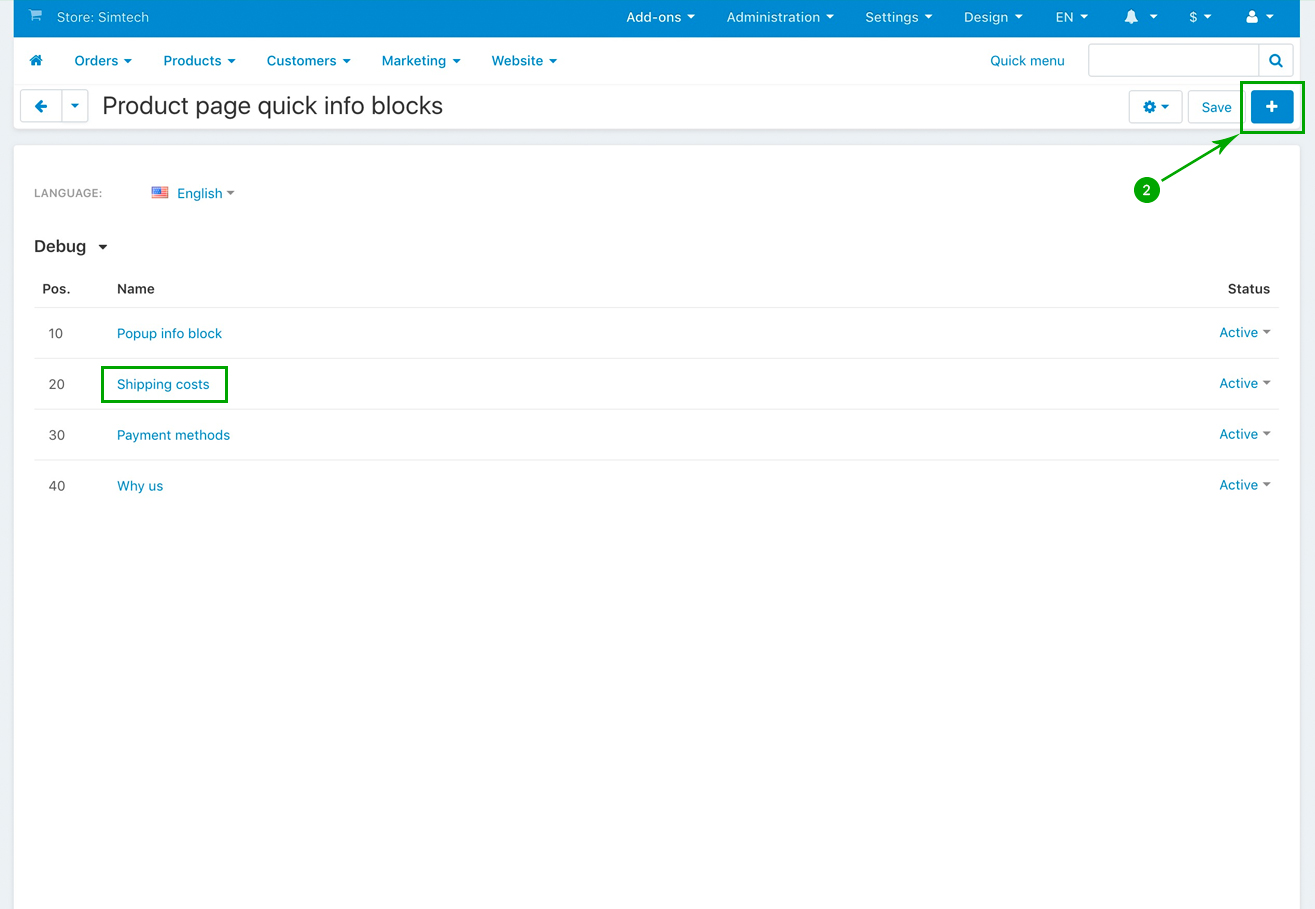
In the next page click on the right side “Plus” to add a new Quick Info block. For the sake of the example, we have cliked on the block called “Shipping costs” that we have created on our demo site.
- Step 3
In the newly opned page, choose your own settings for your newly created Quick Info Block. As of an example, ee’ll show you the settings we have chosed for the demo “Shipping costs” block. When you’re done, click on the top right blue “Save” button
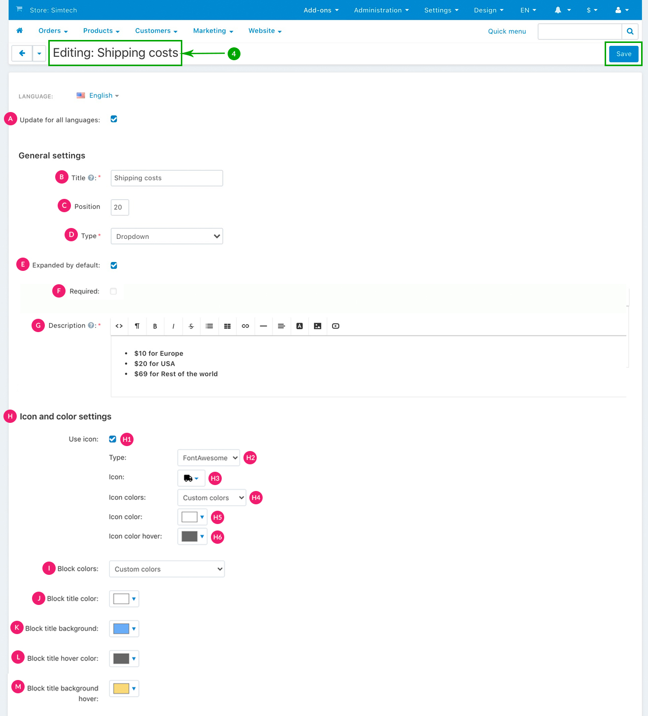
- H1: Use icon - Check this box if you want to add un icon to your Quick Info block. If this box remains unchecked, then no icon will be displayed for your Quick Info block
- H2: Type - If you chose to add an icon to your Quick Info block, select the type of icon you want to use. You can choose between picking a “Font Awesome” icon, or add your own “Custom” icon. We have chsoen a Font Awesome icon in this example
- H3: Icon colors - You have two options: “Use style colors” and “Custom colors”. So, choose “Use style colors” if you want to use the already pre-defined VIVAshop style colors (from your current chosen style), or choose “Custom colors” if you want to use your own custom colors
- H4: Icon color - Pick the color for the icon
- H5: Icon color hover - Pick the icon color when the hover the mouse over it
- Step 4
Repeat all of the above steps in order to create as many “Product Page Quick Info” blocks, as well as customize them as per your own needs.