Extended Banners Pro
We have developed a complex and professional banner creating add-on called “Extended Banner Pro”, so that you may create beautiful and advanced modern HTML banners. The add-on allows you to create professional responsive banners for each device type. In other words, the same banner on desktop version can have either a minimized version for mobile devices (for better loading times on mobiles), or it can be totally different (in case you want to deliver a different information to mobile users only). So, creating such banners is very useful in case you want to deliver different content separately, specific for certain device users.
The “Extended Banners Pro” add-on have plenty of options so you can build beautiful responive banners: add your custom images, add and customize your own HTML text, buttons, fonts, colors, links, image and text animations, image and text positions, backgrounds, etc... Any banner you create can be an Extended Banner. For VIVAshop Multi-Vendor version, vendors can also create Extended Banners for their own store homepages, thus being able to create beautiful stores in your Marketplace, increasing its quality.
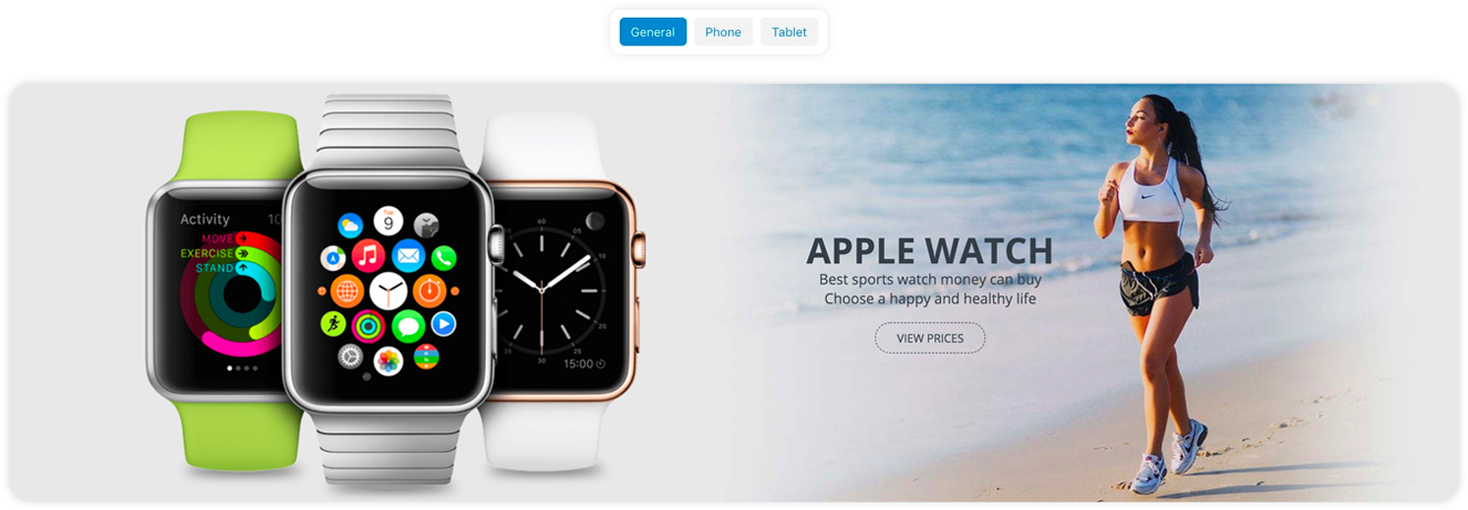
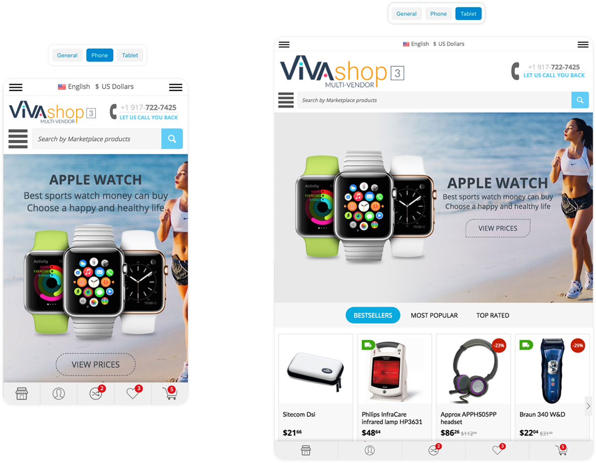
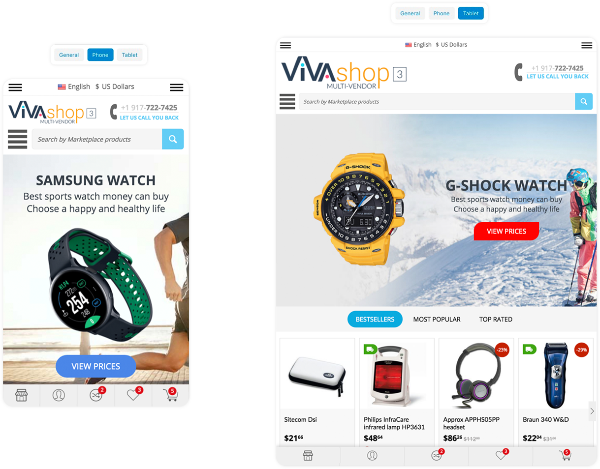
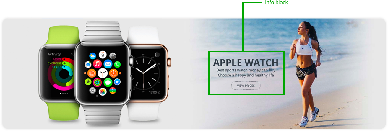
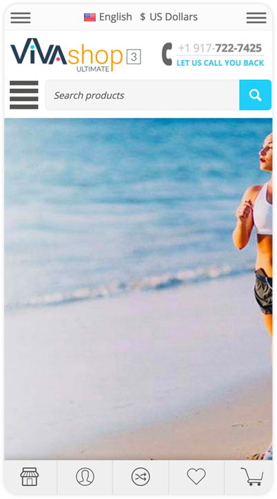
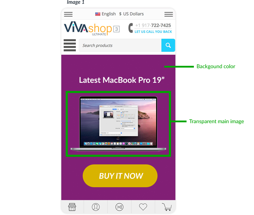
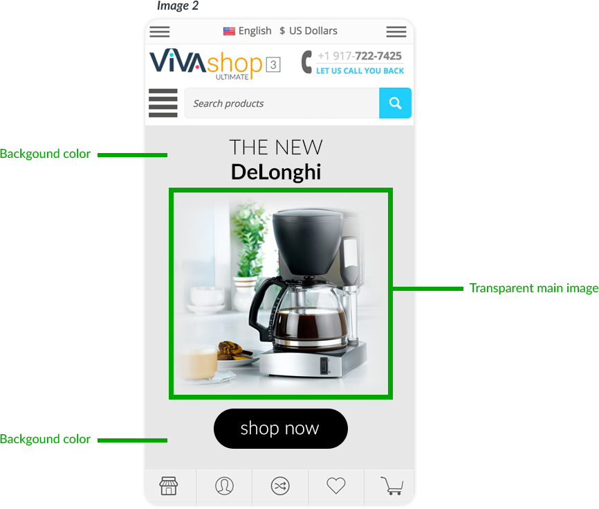
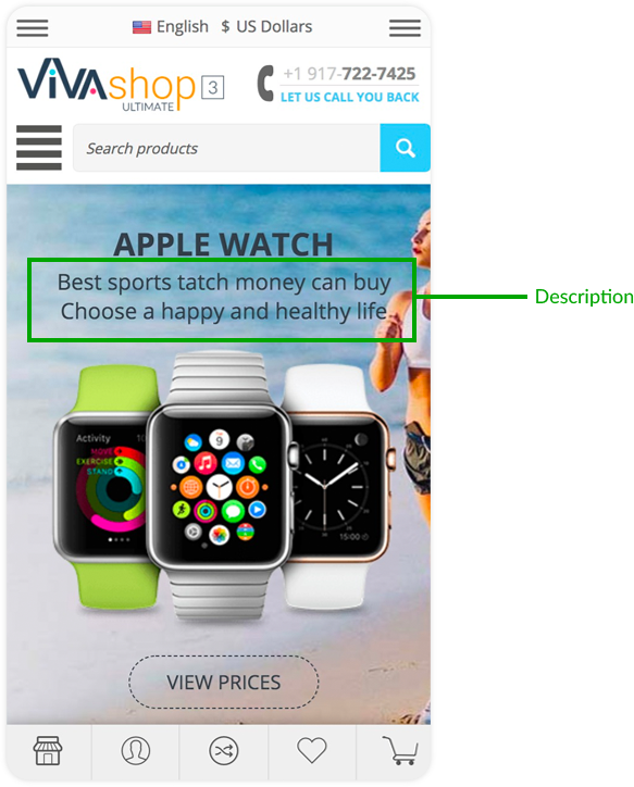
Here’s how the desktop homepage main slider banner looks like with the same content on phones and tables, as well as how it looks like with totally diffrent conent on phones and tablets:
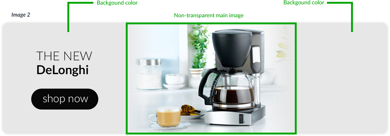
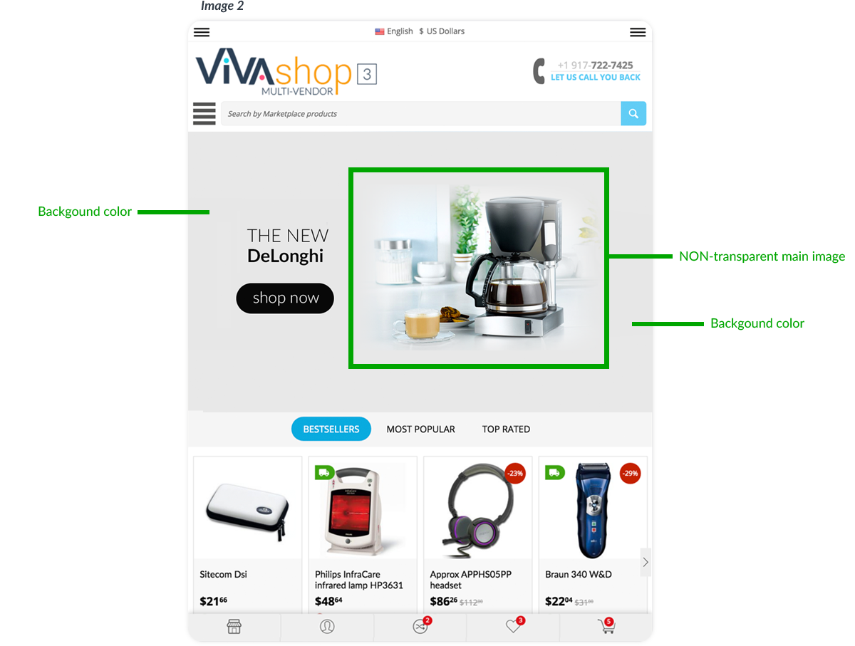
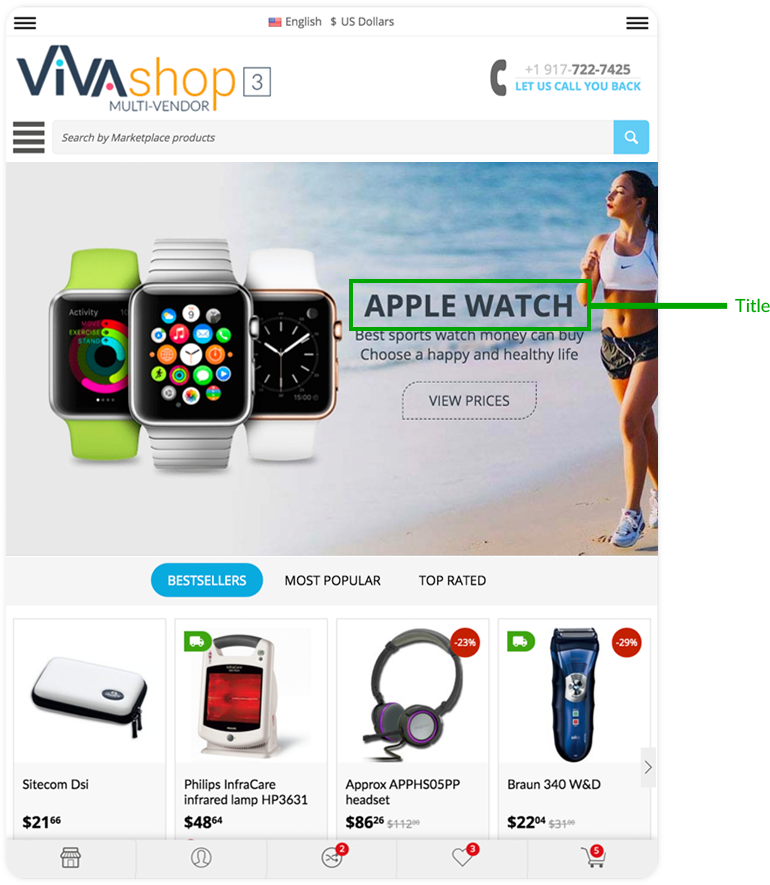
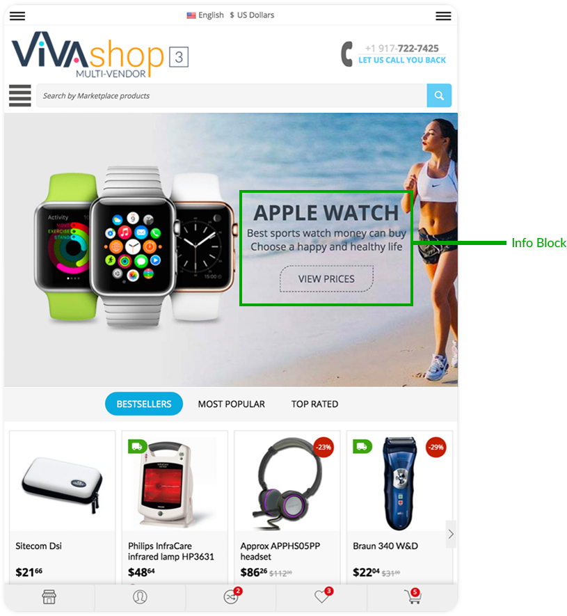
SLIDER BANNER ON DESKTOP
THE SAME SLIDER BANNER WITH THE SAME CONTENT ON PHONE & TABLET
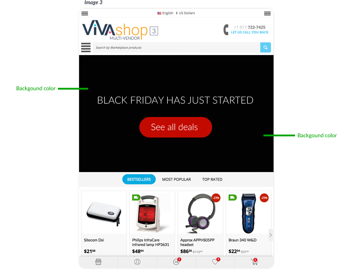
THE SAME SLIDER BANNER WITH DIFFERENT CONTENT ON PHONE & TABLET
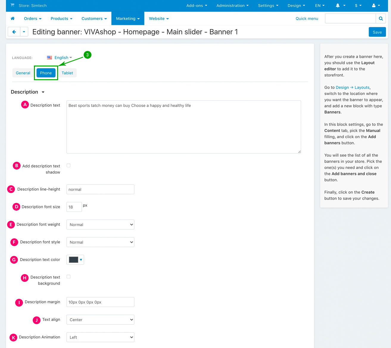
We have developed a very simple and straight forward way to build such banners, so let’s see how it is done and what options you have by recreating the main slider banner called “VIVAshop - Homepage - Main slider - Banner 1” from our demo site. So please follow the steps below:
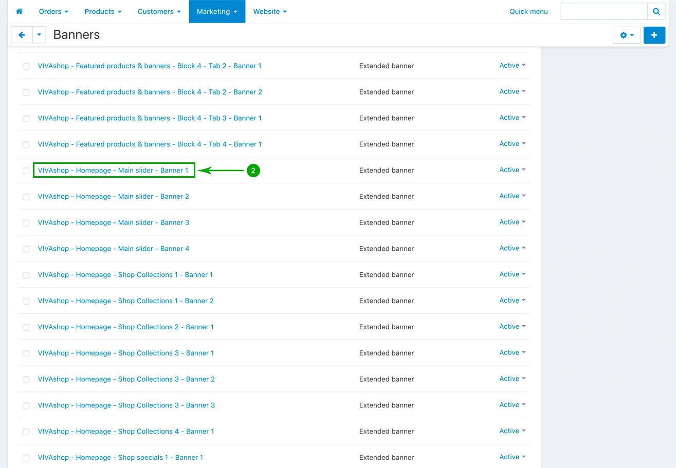
- Step 1
In your admin panel, go to “Marketing” - “Banners”
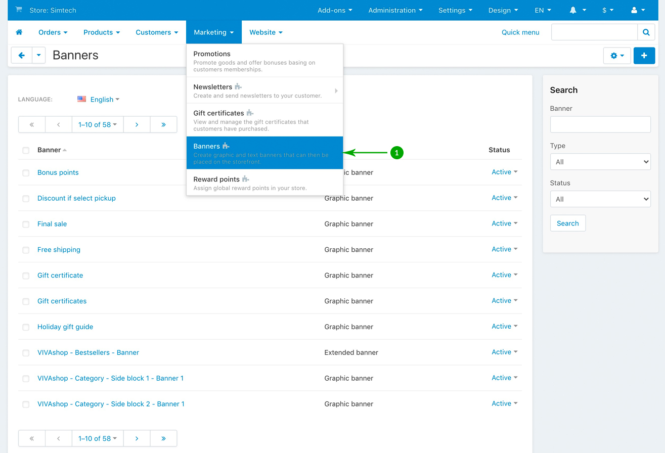
- Step 2
Scroll down and look for the “VIVAshop - Homepage - Main slider - Banner 1” banner, and click on it
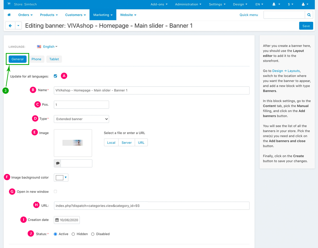
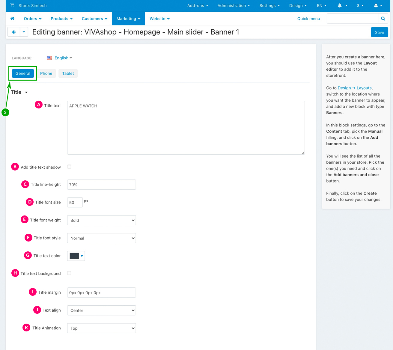
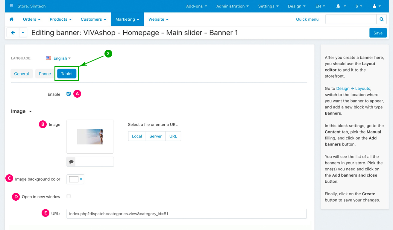
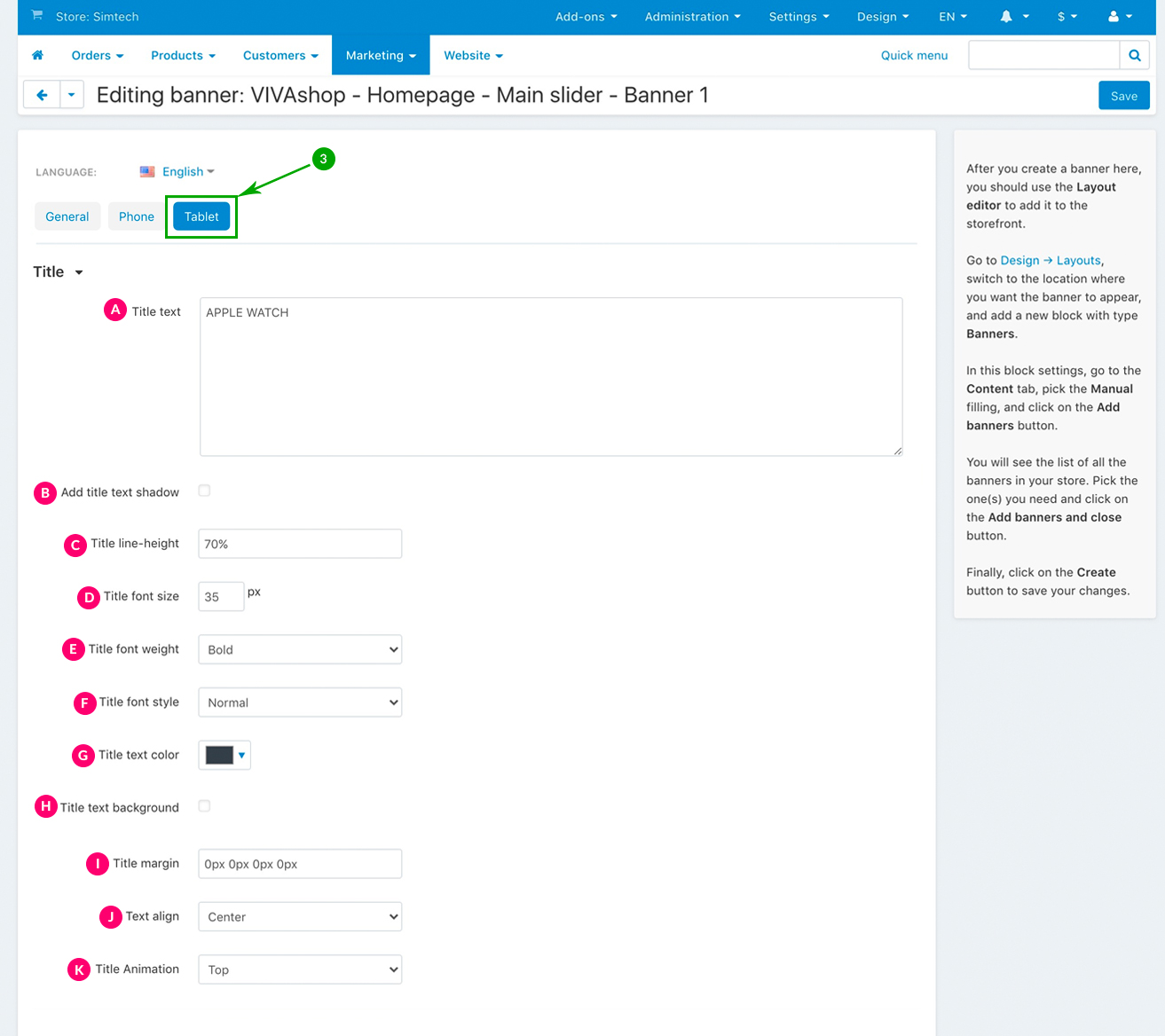
- Step 3
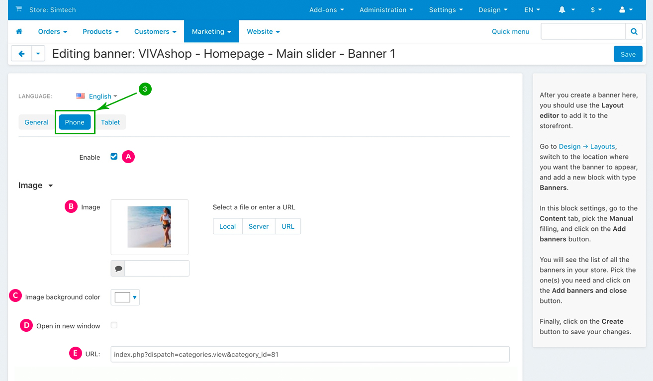
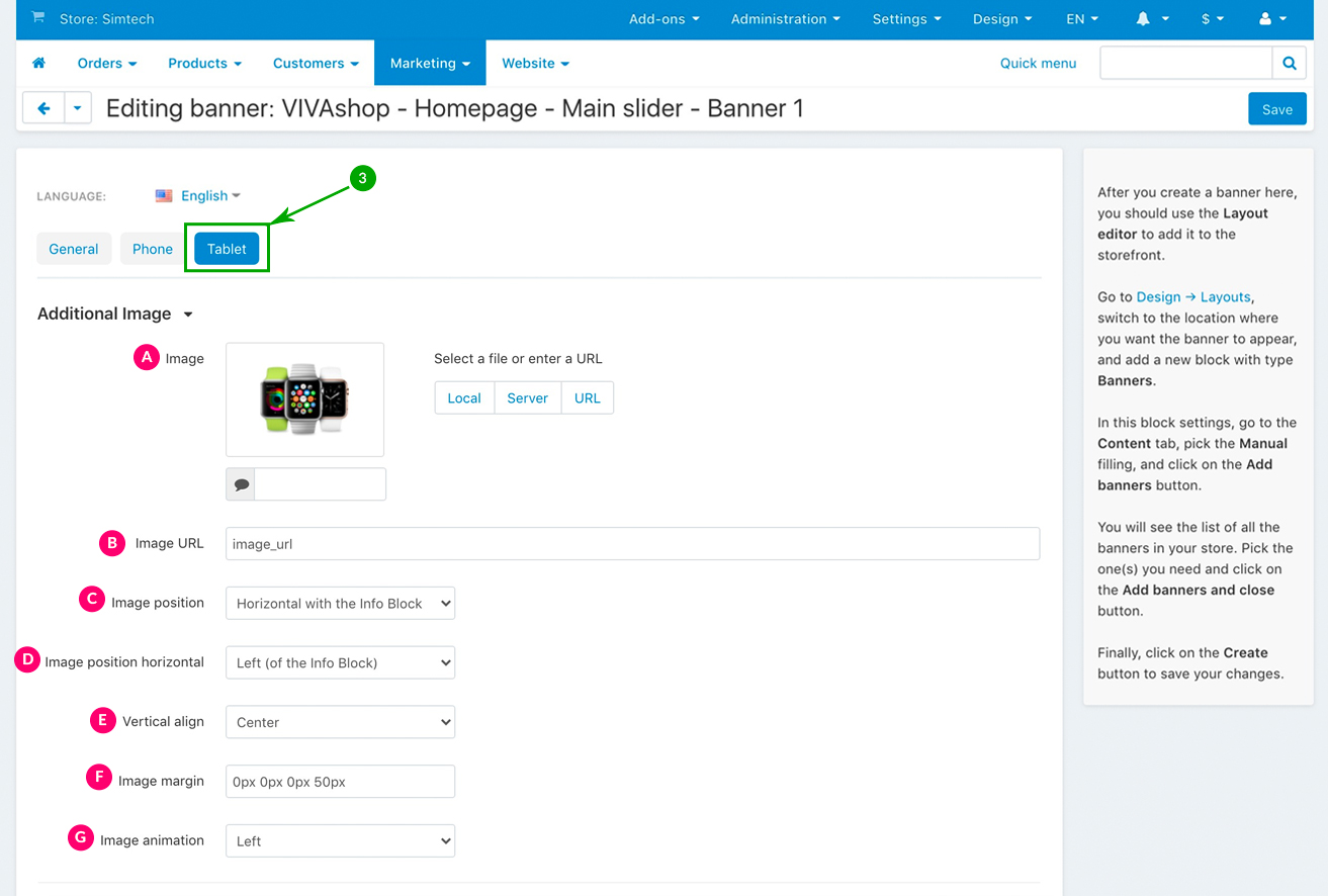
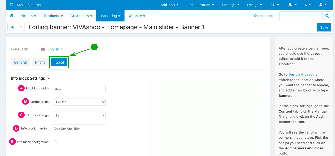
In the newly opened window, you can now set individual banner settings for DESKTOP, PHONE and TABLET. Below we’ll explain each of them.
Setting up the banner for DESKTOP version
Basic settings
These are the basic settings for your banner. Choose them as per the indications below:
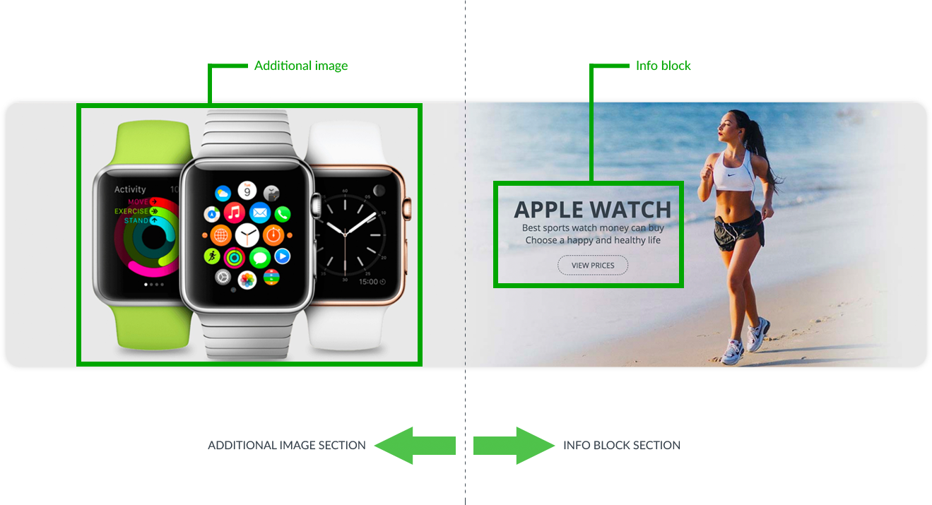
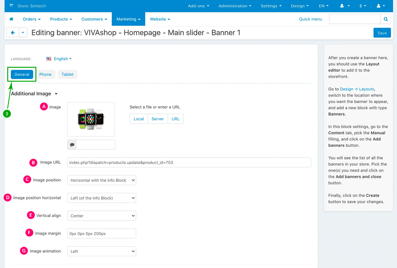
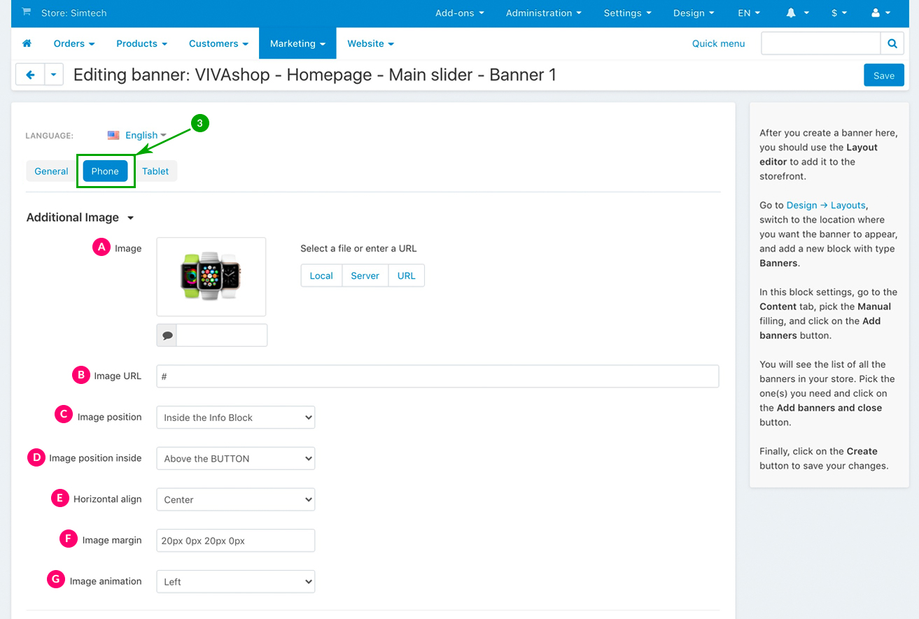
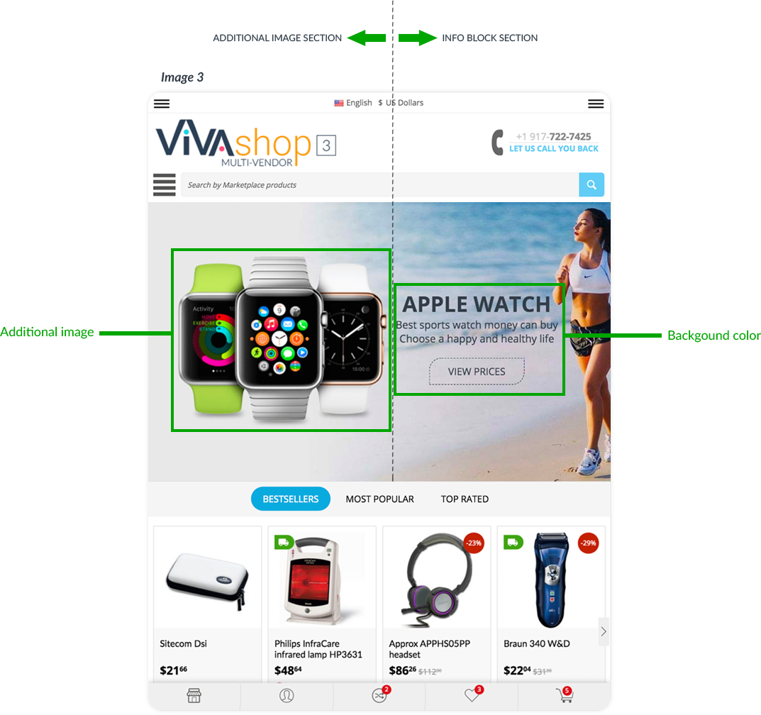
Additional Image settings
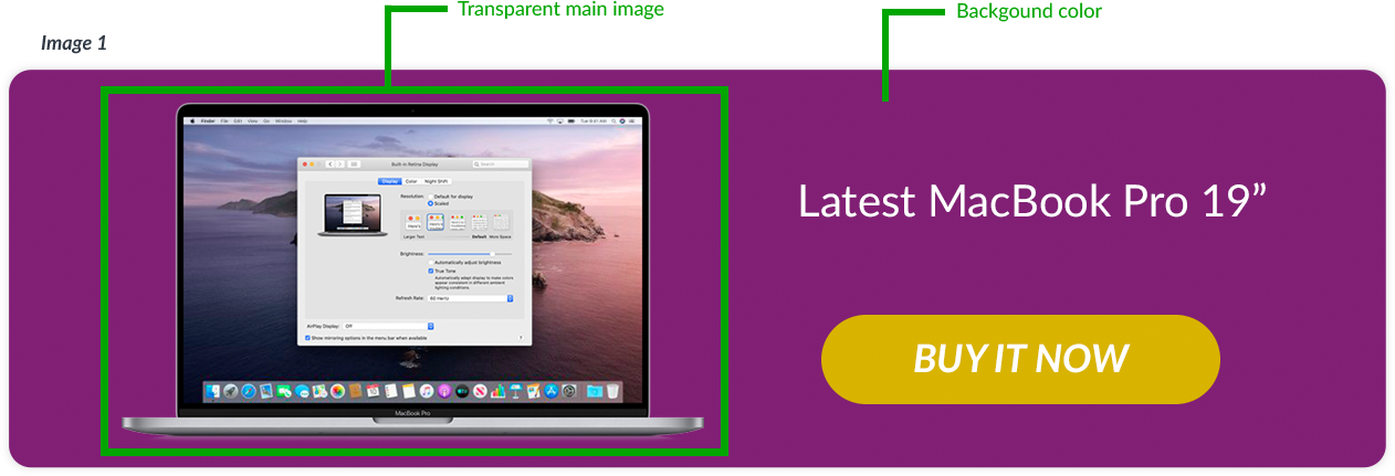
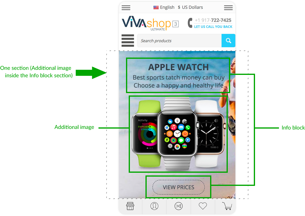
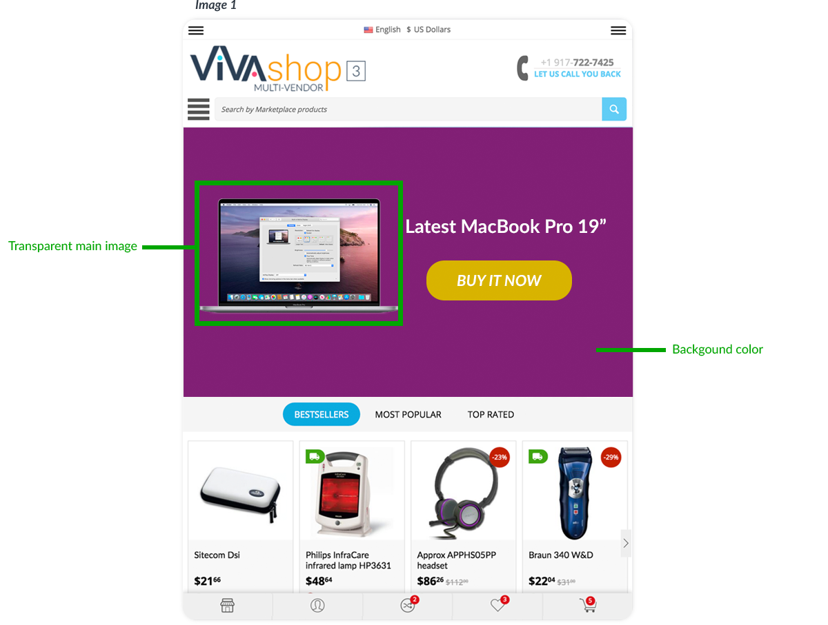
In addition to the banner main image you can also add another image inside the banner, which will be displayed above the banner main image/background. There are several settings that you can choose form for this image, including adding different animations.
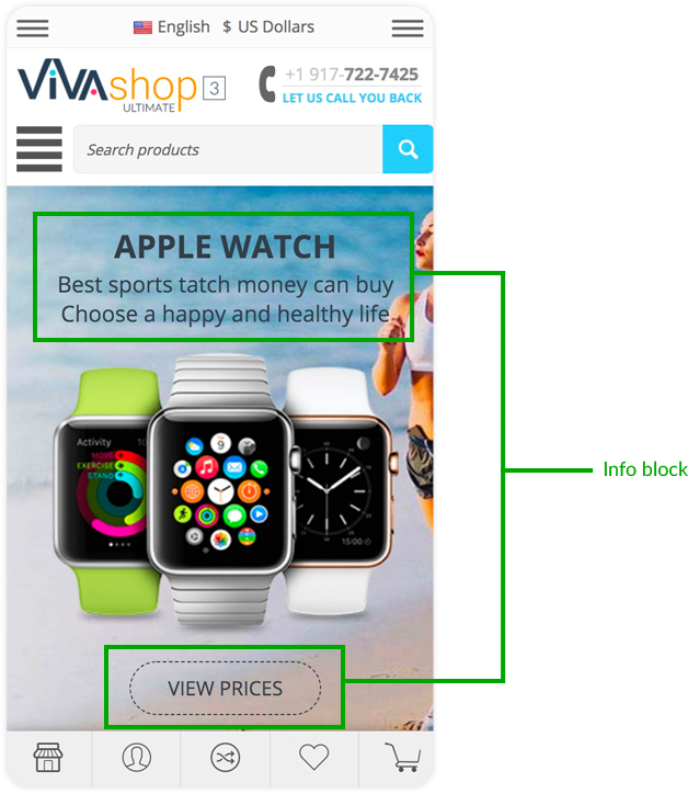
When you add an additional image. your banner will be divided in two sections, either horizontally or vertically, one section will be the one which includes the Additional Image, the other section being the one which includes the Info Block. The Info Block consists of the text that you’ll use in the banner (tile and description), as well as the banner button.
The width of each section is determined by the Additional Image width (if it is positioned horizontally with the Info Block). In other words, the width of the section where Additional Image is located is equal to the image width, and the rest of banner width will belong to the Info Block section. Also, (if it is positioned vertically with the Info Block, the height of each section is determined by the Additional Image height. In other words, the height of the section where the Additional Image is located is equal to the image height, and the rest of banner height will belong to the Info Block section.
The additional image should preferably be in .png format with a transparent background. It can have any size of your choice, but keep in mind that this should only be an image in addition to the already existing main image (if you choose to add a main image), so its size will pretty much depend on the main image you have chosen in the above steps. The size of the additional image that we used in the “VIVAshop - Homepage - Main slider - Banner 1” demo banner is 705pxX581px.
These are the settings for your additional image. Choose them as per the indications below:
- Horizontal with the Info Block - Both the Additional Image and the Info Block are positioned horizontally (one next to the other)
- Vertical with the Info Block - Both the Additional Image and the Info Block are positioned vertically (one below the other)
- Inside the Info Block - Both the Additional Image and the Info Block are in the same section, so the two sections that we talked about above become only one
Points D and E depend on what you have chosen at point C. Therefore, if at point C you have chosen “Horizontal with the Info Block” for the image position, points D and E will be as follows:
- Left (of the Info Block) - The Additional Image will be placed on the left side of the Info Block, so the Info Block will be placed on the right side section. Note that if no margins are selected (see point F below), the Additional Image will be placed by default at the very left of the banner.
- Right (of the Info Block) - The Additional Image will be placed on the right side of the Info Block, so the Info Block will placed on the left side section. Note that if no margins are selected (see point F below), the Additional Image will be placed by default at the very right of the banner.
- Top - The Additional Image will be placed on top of its section
- Center - The Additional Image will be placed in the center of its section
- Bottom - The Additional Image will be placed on the bottom of its section
If at point C you have chosen “Vertical with the Info Block” for the image position, points D and E will be as follows:
- Above (the Info Block) - The Additional Image will be placed above the Info Block, so the Info Block will placed in the section below. Note that if no margins are selected (see point F below), the Additional Image will be placed by default at the very top of the banner.
- Below (of the Info Block) - The Additional Image will be placed below the Info Block, so the Info Block will placed in the section above. Note that if no margins are selected (see point F below), the Additional Image will be placed by default at the very bottom of the banner.
- Left - The Additional Image will be placed on the left side of its section
- Center - The Additional Image will be placed in the center of its section
- Right - The Additional Image will be placed on the right side of its section
If at point C you have chosen “Inside Info Block” for the image position, points D and E will be as follows:
- Above the TITLE - The Additional Image will be placed above the Info Block title
- Above the DESCRIPTION - The Additional Image will be placed the Info Block description
- Above the BUTTON - The Additional Image will be placed above the button from the Info Block
- Below the BUTTON - The Additional Image will be placed below the button from the Info Block
- Left - The Additional Image will be placed on the left side of its section
- Center - The Additional Image will be placed in the center of its section
- Right - The Additional Image will be placed on the right side of its section
For the “VIVAshop - Homepage - Main slider - Banner 1” banner we have used the following options for sections C, D and E:
- Auto - Image will come from a predefined direction depending on the image position settings
- Left - Image will come from the left side
- Right - Image will come from the right side
- Top - Image will come from the top
- Bottom - Image will come from the bottom
- Off - Turn off the image animation
For the “VIVAshop - Homepage - Main slider - Banner 1” banner we have chosen the “Left” option, so the Additional Image will come from the left.
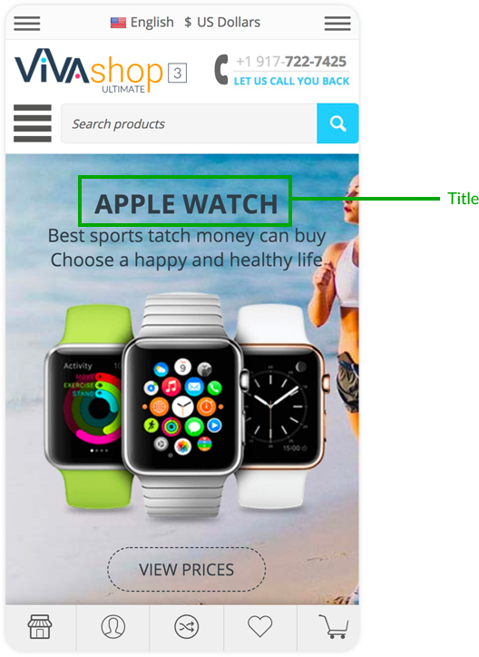
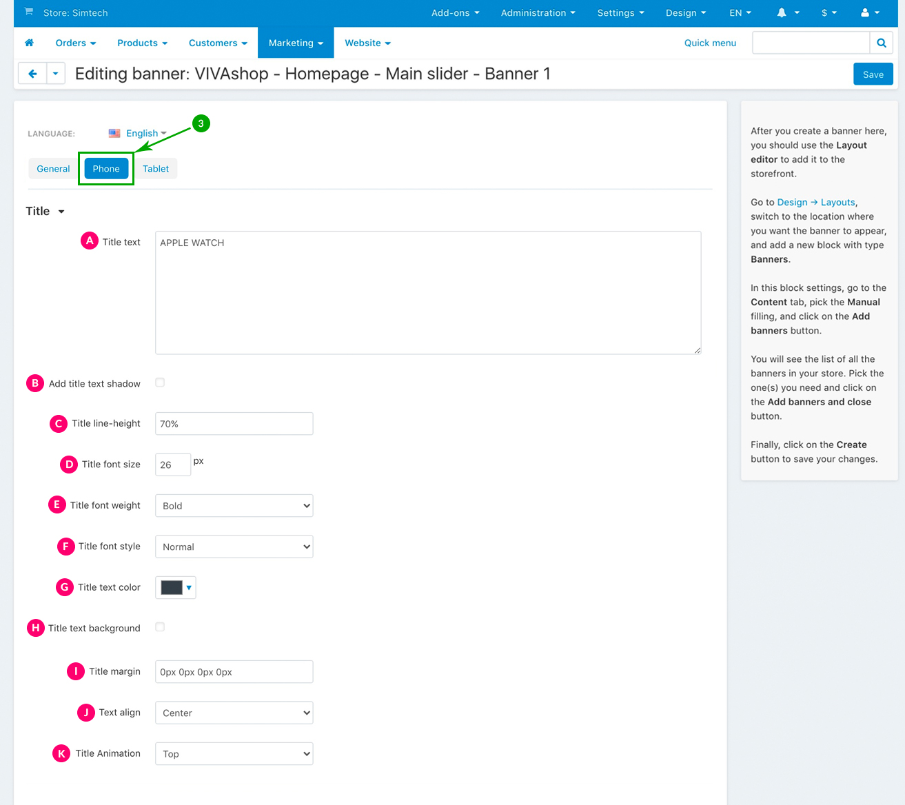
Title settings
Your banner can have any text title of our choice which can either be simple text or HTML. There are several settings that you can choose form for the Info Bock title, including adding different animations.
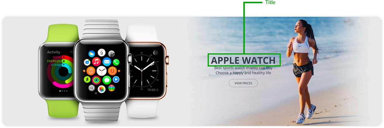
These are the settings for your Info Block title. Choose them as per the indications below:
- Normal
- Light
- Bold
- Normal
- Italic
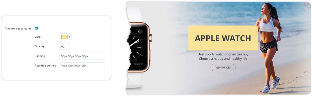
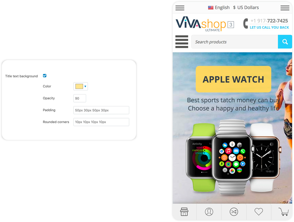
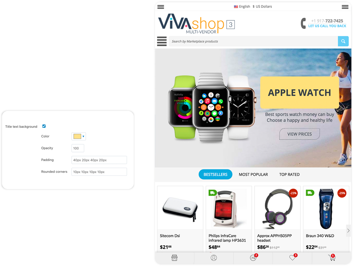
So, if you choose to add a background to your title, firstly check the “Title text background” option. Then, you will have the following options:
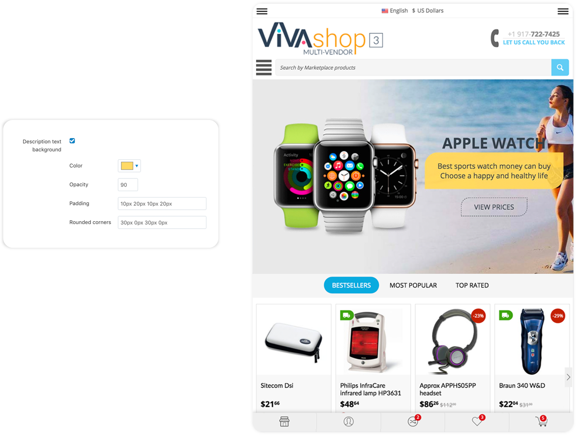
- Color - From the color picker choose the color for your title background (we used a yellow color for the background)
- Opacity - Enter the desired opacity level, in percentages (we used 90% in this example)
- Padding - Paddings are used to generate space around an element's content, inside of any defined borders. In our case, the element is the title text and the borders are defined by the title background borders. Paddings create space around the title text accordingly. For example, if you set a padding to the left of the title text, there will be a space created to the left of the title text, and the title text will move to the right. The more padding to the left, the more the title text will move to the right. The setting format is similar to margins, “TTpx RRpx BBpx LLpx”, where “TT” is the size of the padding top (space is created on top, so title text is pushed to the bottom), “RR” is the size of the padding right (space is created on the right, so the title text is pushed to the left), “BB” is the size of the padding bottom (space is created at the bottom, so the title text is pushed up), and “LL” is the size of the padding left (space is created on the left, so title text is pushed to the right). All of these values can be set in percentages as well, the percent value representing a percent of the title container. The values that we have set for the “Title text background” in the example above are “50px 30px 50px 30px”, meaning that, we have created a space of 50px above and below the title text, and 30px to the right and to the left of the title text, inside the title text background.
- Rounded corners - Set the corners for your title text background. The setting format is same as margins and paddings, meaning “TLpx TRpx BRpx BLpx”, where “TL” is the value for the top left corner, “TR” is the value for the top right corner , “BR” is the value for the bottom right corner, and “BL” is the value for the bottom left corner. These values are in pixels. In the above example we have used “10px 10px 10px 10px”, meaning that all background corners have a 10px radius.
- Left - Place the title text on the left, inside the Info Block
- Center - Place the title text in the center, inside the Info Block (this is the option that we have selected for the demo “VIVAshop - Homepage - Main slider - Banner 1” banner)
- Left - Place the title text on the right, inside the Info Block
The Info Block width is determined by the widest element (from Title, Description and Button). If the title is the widest element, then the “Text align” option will not have any effect.
- Auto - Title will come from a predefined direction depending on the image position settings
- Left - Title will come from the left side
- Right - Title will come from the right side
- Top - Title will come from the top
- Bottom - Title will come from the bottom
- Off - Turn off the Title text animation
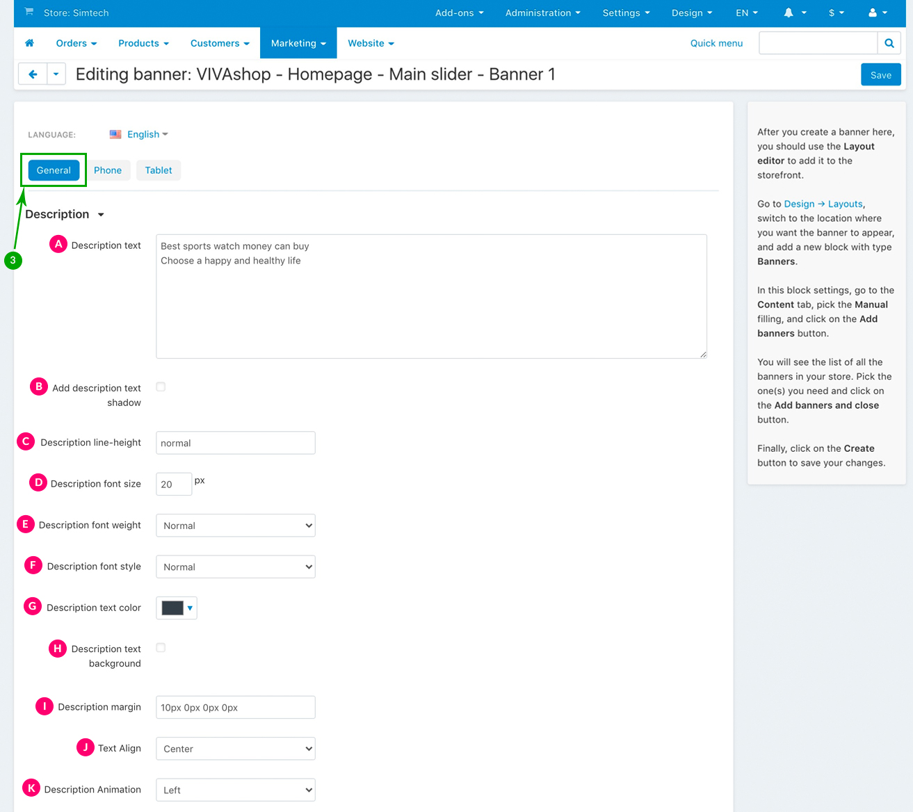
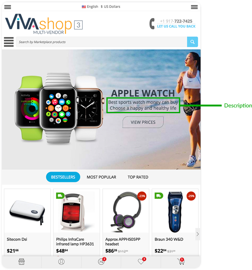
Description settings
Your banner can have any text description of our choice which can either be simple text or HTML. There are several settings that you can choose form for the Info Bock description, including adding different animations.
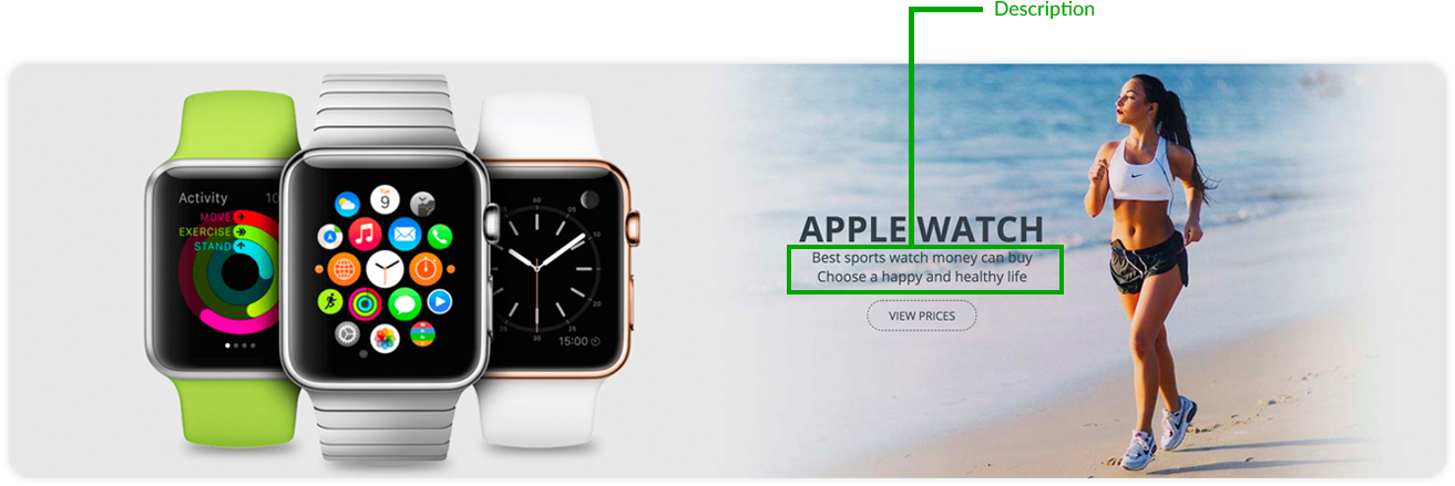
These are the settings for your Info Block description. Choose them as per the indications below:
- Normal
- Light
- Bold
- Normal
- Italic
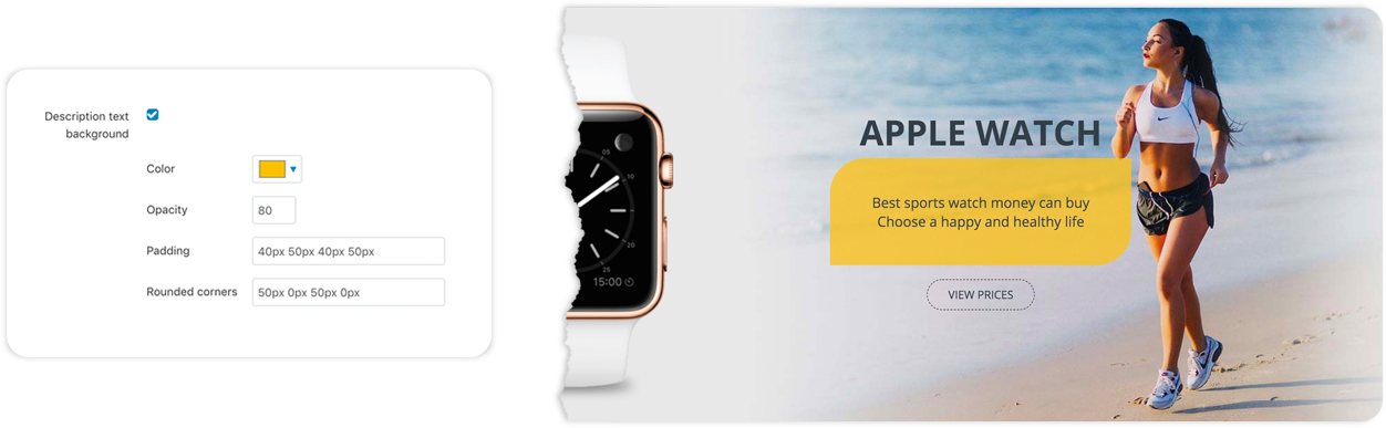
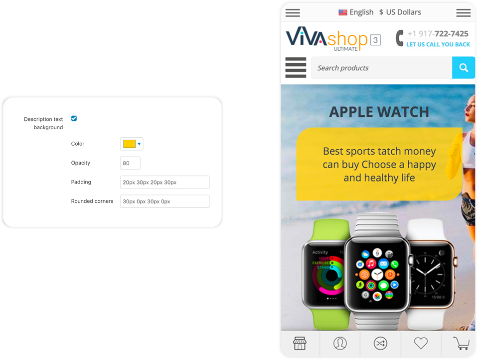
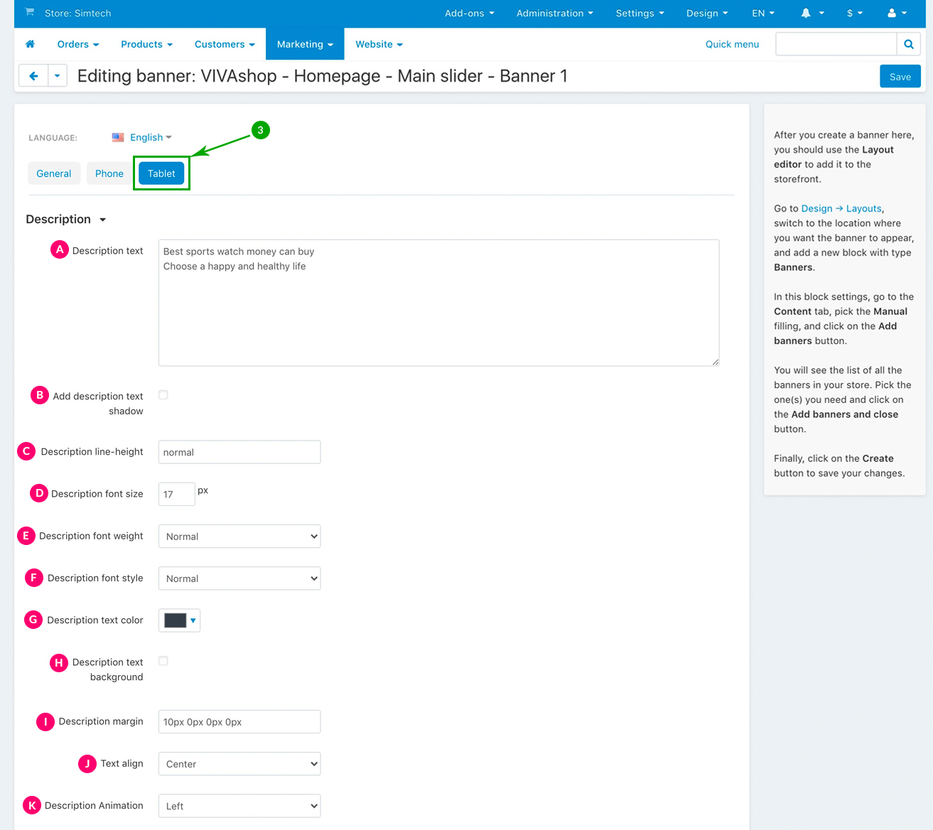
So, if you choose to add a background to your description, firstly check the “Description text background” option. Then. you will have the following options:
- Color - From the color picker choose the color for your description background (we used a yellow color for the background)
- Opacity - Enter the desired opacity level, in percentages (we used 90% in this example)
- Padding - Paddings are used to generate space around an element's content, inside of any defined borders. In our case, the element is the description text and the borders are defined by the description background borders. Paddings create space around the description text accordingly. For example, if you set a padding to the left of the description text, there will be a space created to the left of the description text, and the description text will move to the right. The more padding to the left, the more the description text will move to the right. The setting format is similar to margins, “TTpx RRpx BBpx LLpx”, where “TT” is the size of the padding top (space is created on top, so description text is pushed to the bottom), “RR” is the size of the padding right (space is created on the right, so the description text is pushed to the left), “BB” is the size of the padding bottom (space is created at the bottom, so the description text is pushed up), and “LL” is the size of the padding left (space is created on the left, so description text is pushed to the right). All of these values can be set in percentages as well, the percent value representing a percent of the description container. The values that we have set for the “Description text background” in the example above are “40px 50px 40px 50px”, meaning that, we have created a space of 40px above and below the description text, and 50px to the right and to the left of the description text, inside the description text background.
- Rounded corners - Set the corners for your description text background. The setting format is same as margins and paddings, meaning “TLpx TRpx BRpx BLpx”, where “TL” is the value for the top left corner, “TR” is the value for the top right corner , “BR” is the value for the bottom right corner, and “BL” is the value for the bottom left corner. These values are in pixels. In the above example we have used “50px 0px 50px 0px”, meaning that the top left and bottom right of the background have a radius of 50px, whereas the top right and bottom left corners do not have any roundness at all.
- Left - Place the description text on the left, inside the Info Block
- Center - Place the description text in the center, inside the Info Block (this is the option that we have selected for the demo “VIVAshop - Homepage - Main slider - Banner 1” banner)
- Left - Place the description text on the right, inside the Info Block
The Info Block width is determined by the widest element (from Title, Description and Button). If the description is the widest element, then the “Description align” option will not have any effect.
- Auto - Description will come from a predefined direction depending on the image position settings
- Left - Description will come from the left side
- Right - Description will come from the right side
- Top - Description will come from the top
- Bottom - Description will come from the bottom
- Off - Turn off the description text animation
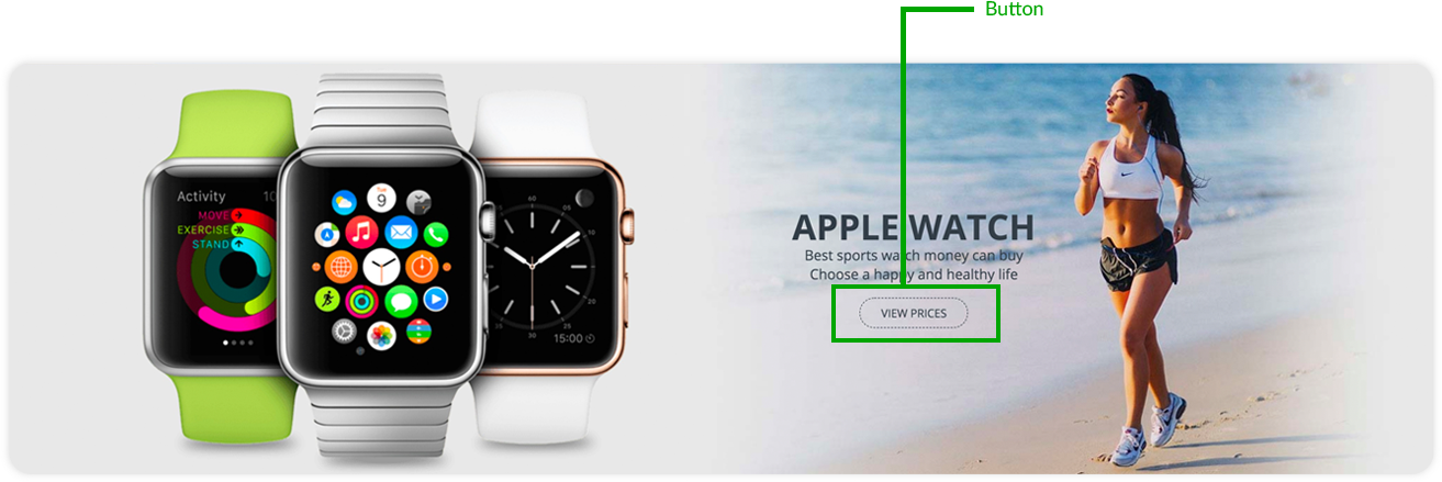
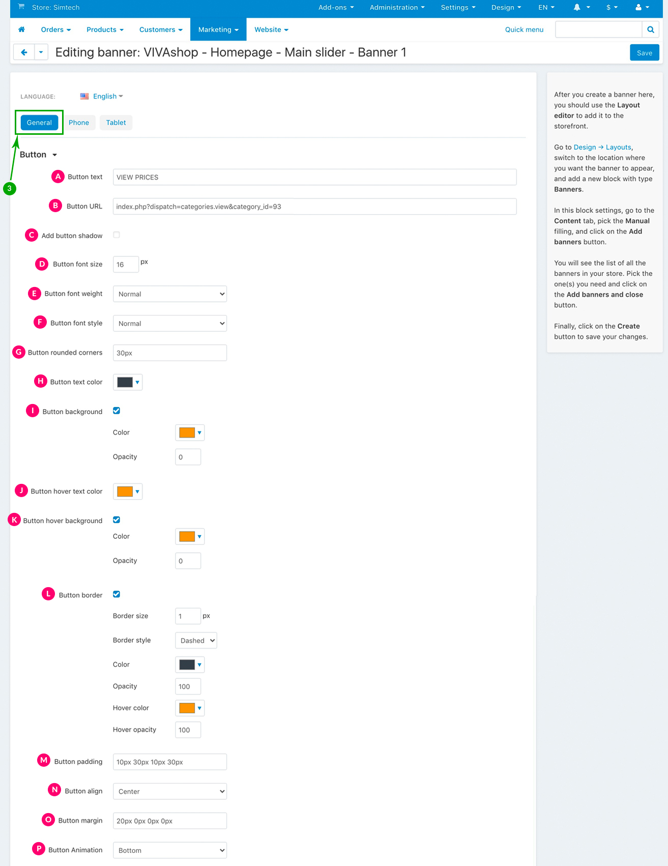
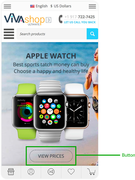
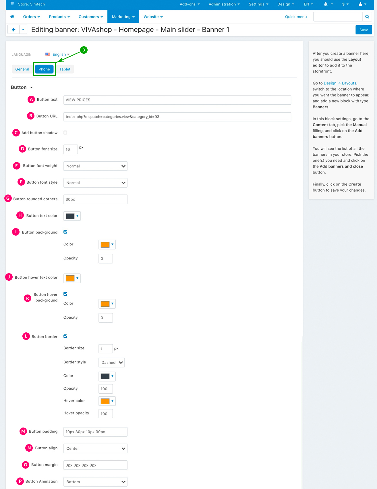
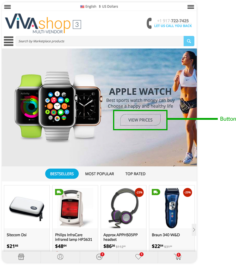
Button settings
In your extended banner you can include a button that you can customize in plenty of ways, from colors, shapes, borders, alignments, shadow, to font styles and animations. Also, the link you add to this button can be completely different from the link you add to the background image and/or the additional image.
These are the settings for your Info Block button. Choose them as per the indications below:
- Normal
- Light
- Bold
- Normal
- Italic
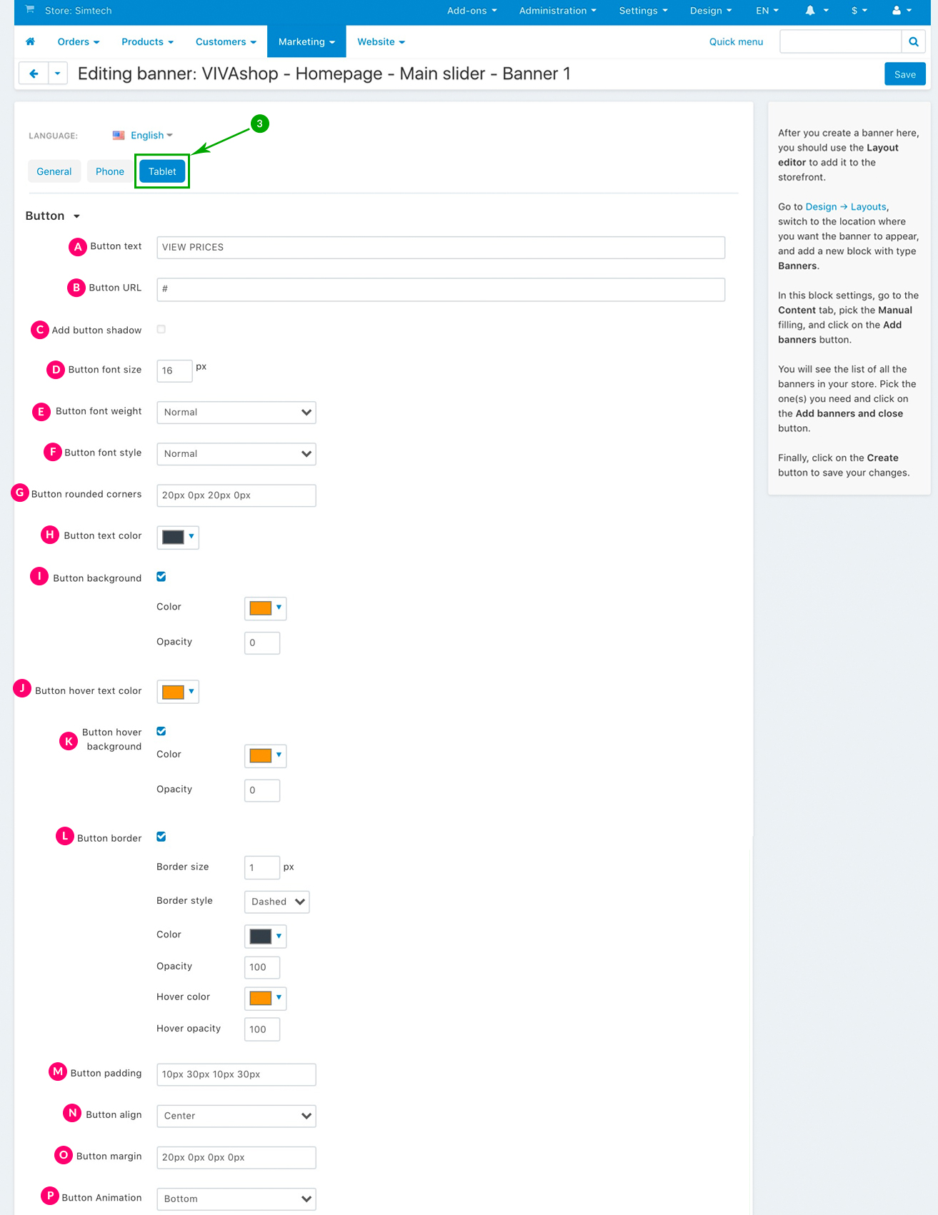
- Color - From the color picker choose the color for your button background (we used a yellow color for the background)
- Opacity - Enter the desired opacity level, in percentages (we used 0% in this example, which means that the button backgammon is transparent)
- Color - From the color picker choose the color for your button background (we used a yellow color for the background)
- Opacity - Enter the desired opacity level, in percentages (we used 0% in this example, which means that the button backgammon is transparent)
- Border size - Enter the size in pixels for the button border
-
Border style - Here you have 3 options that you can select from the dropdown:
- - Solid
- - Dashed (this is the option we have used in this example)
- - Dotted
- Color - Pick the color for your button border
- Opacity - Set the opacity level for your border, in percentages (we used 100% in our example here)
- Hover color - Pick the color of for the button border, when hovering over the button
- Hover opacity - Set the opacity level for your border when hovering over the button, in percentages (we used 100% in our example here)
- Left - Place the button on the left, inside the Info Block
- Center - Place the button in the center, inside the Info Block (this is the option that we have selected for the demo “VIVAshop - Homepage - Main slider - Banner 1” banner)
- Left - Place the button on the right, inside the Info Block
The Info Block width is determined by the widest element (from Title, Description and Button). If the button is the widest element, then the “Button align” option will not have any effect.
- Auto - Button will come from a predefined direction depending on the Button position settings
- Left - Button will come from the left side
- Right - Button will come from the right side
- Top - Button will come from the top
- Bottom - Button will come from the bottom
- Off - Turn off the Button animation
For the “VIVAshop - Homepage - Main slider - Banner 1” banner we have chosen the “Bottom” option, so the Additional Image will come from the bottom.
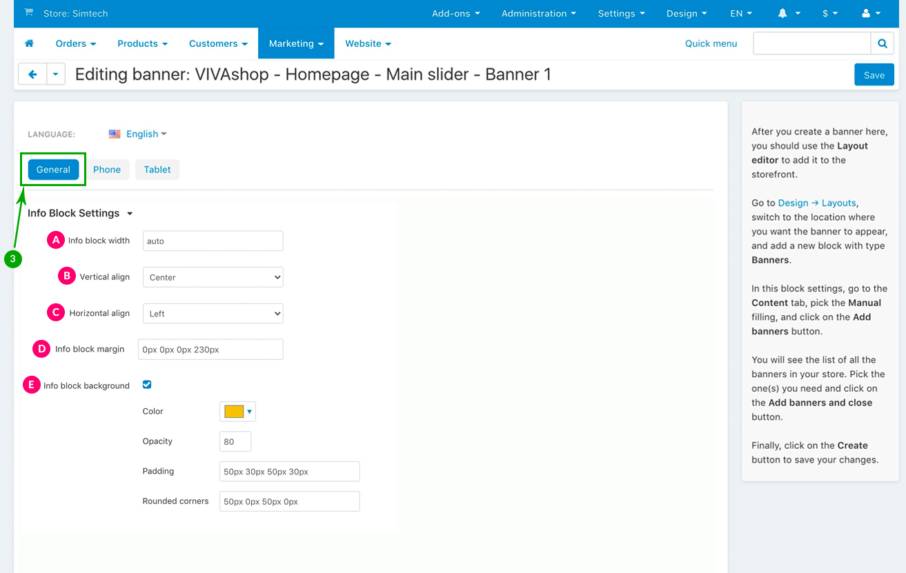
Info Block settings
As mentioned previously, the banner Info Block includes the banner Title, Description and Button. There are several settings that you can choses from for the Info Block including adding a background which can also be customized.
These are the settings for your Info Block. Choose them as per the indications below:
- Top - The Info Block will be placed on the top of the banner
- Center - The Info Block will be placed in the center of the banner. This is the option we have selected for our example banner
- Bottom - The Info Block will be placed at the bottom of the banner
- Left - The Info Block will be placed on the left of the banner. This is the option we have selected for our example banner.
- Center - The Info Block will be placed in the center of the banner.
- Right - The Info Block will be placed on the right of the banner.
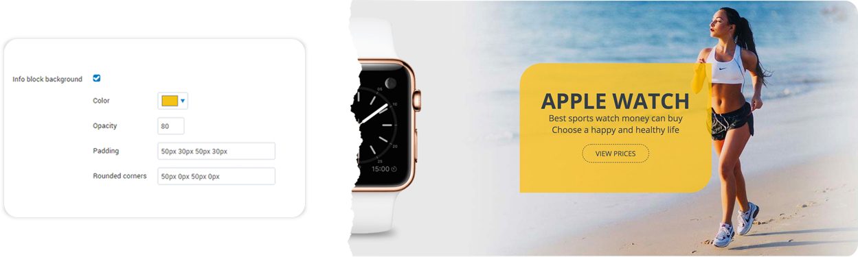
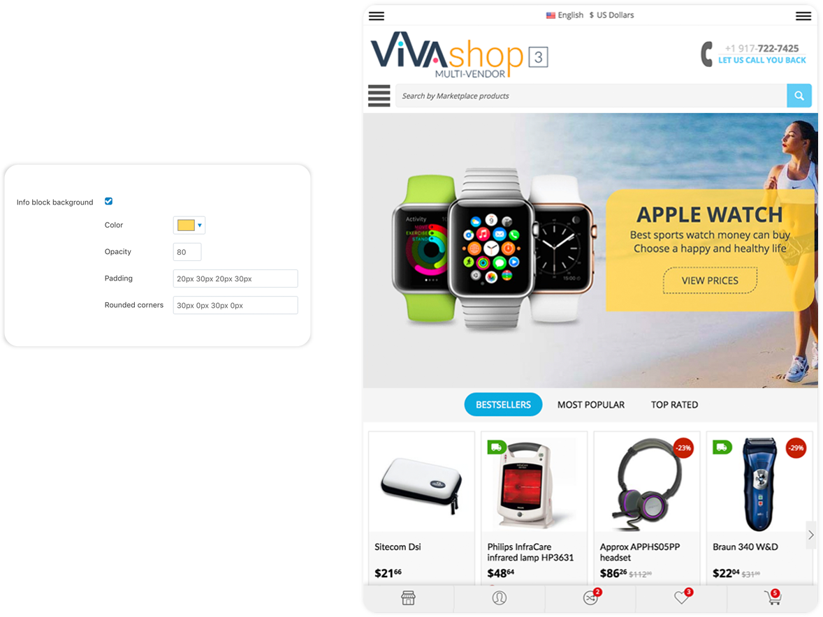
So, if you choose to add a background to your Info Block, firstly check the “Info block background” option. Then, you will have the following options:
- Color - From the color picker choose the color for your Info Block background (we used a yellow color for the background)
- Opacity - Enter the desired opacity level, in percentages (we used 80% in this example)
- Padding - Paddings are used to generate space around an element's content, inside of any defined borders. In our case, the element is the Info Block text and the borders are defined by the Info Block background borders. Paddings create space around the Info Block text accordingly. For example, if you set a padding to the left of the Info Block text, there will be a space created to the left of the Info Block text, and the Info Block text will move to the right. The more padding to the left, the more the Info Block text will move to the right. The setting format is similar to margins, “TTpx RRpx BBpx LLpx”, where “TT” is the size of the padding top (space is created on top, so Info Block text is pushed to the bottom), “RR” is the size of the padding right (space is created on the right, so the Info Block text is pushed to the left), “BB” is the size of the padding bottom (space is created at the bottom, so the Info Block text is pushed up), and “LL” is the size of the padding left (space is created on the left, so Info Block text is pushed to the right). All of these values can be set in percentages as well, the percent value representing a percent of the Info Block container. The values that we have set for the “Info Block background” in the example above are “50px 30px 50px 30px”, meaning that, we have created a space of 50px above and below the Info Block text, and 30px to the right and to the left of the Info Block text, inside the Info Block text background.
- Rounded corners - Set the corners for your Info Block text background. The setting format is same as margins and paddings, meaning “TLpx TRpx BRpx BLpx”, where “TL” is the value for the top left corner, “TR” is the value for the top right corner , “BR” is the value for the bottom right corner, and “BL” is the value for the bottom left corner. These values are in pixels. In the above example we have used “50px 0px 50px 0px”, meaning that the top left and bottom right of the background have a radius of 50px, whereas the top right and bottom left corners do not have any roundness at all.
Setting up the banner for MOBILE version
Basic settings:
These are the basic settings for your banner. Choose them as per the indications below:
Additional Image settings
In addition to the banner main image you can also add another image inside the banner, which will be displayed above the banner main image/background. There are several settings that you can choose form for this image, including adding different animations.
When you add an additional image. your banner will be divided in two sections, either horizontally or vertically, one section will be the one which includes the Additional Image, the other section being the one which includes the Info Block. The Info Block consists of the text that you’ll use in the banner (tile and description), as well as the banner button.
The width of each section is determined by the Additional Image width (if it is positioned horizontally with the Info Block). In other words, the width of the section where Additional Image is located is equal to the image width, and the rest of banner width will belong to the Info Block section. Also, (if it is positioned vertically with the Info Block, the height of each section is determined by the Additional Image height. In other words, the height of the section where the Additional Image is located is equal to the image height, and the rest of banner height will belong to the Info Block section.
The additional image should preferably be in .png format with a transparent background. It can have any size of your choice, but keep in mind that this should only be an image in addition to the already existing main image (if you choose to add a main image), so its size will pretty much depend on the main image you have chosen in the above steps. The size of the additional image that we used in the “VIVAshop - Homepage - Main slider - Banner 1” demo banner is 705pxX581px.
These are the settings for your additional image. Choose them as per the indications below:
- Horizontal with the Info Block - Both the Additional Image and the Info Block are positioned horizontally (one next to the other)
- Vertical with the Info Block - Both the Additional Image and the Info Block are positioned vertically (one below the other)
- Inside the Info Block - Both the Additional Image and the Info Block are in the same section, so the two sections that we talked about above become only one
Points D and E depend on what you have chosen at point C. Therefore, if at point C you have chosen “Horizontal with the Info Block” for the image position, points D and E will be as follows:
- Left (of the Info Block) - The Additional Image will be placed on the left side of the Info Block, so the Info Block will be placed on the right side section. Note that if no margins are selected (see point F below), the Additional Image will be placed by default at the very left of the banner.
- Right (of the Info Block) - The Additional Image will be placed on the right side of the Info Block, so the Info Block will placed on the left side section. Note that if no margins are selected (see point F below), the Additional Image will be placed by default at the very right of the banner.
- Top - The Additional Image will be placed on top of its section
- Center - The Additional Image will be placed in the center of its section
- Bottom - The Additional Image will be placed on the bottom of its section
If at point C you have chosen “Vertical with the Info Block” for the image position, points D and E will be as follows:
- Above (the Info Block) - The Additional Image will be placed above the Info Block, so the Info Block will placed in the section below. Note that if no margins are selected (see point F below), the Additional Image will be placed by default at the very top of the banner.
- Below (of the Info Block) - The Additional Image will be placed below the Info Block, so the Info Block will placed in the section above. Note that if no margins are selected (see point F below), the Additional Image will be placed by default at the very bottom of the banner.
- Left - The Additional Image will be placed on the left side of its section
- Center - The Additional Image will be placed in the center of its section
- Right - The Additional Image will be placed on the right side of its section
If at point C you have chosen “Inside Info Block” for the image position, points D and E will be as follows:
- Above the TITLE - The Additional Image will be placed above the Info Block title
- Above the DESCRIPTION - The Additional Image will be placed the Info Block description
- Above the BUTTON - The Additional Image will be placed above the button from the Info Block
- Below the BUTTON - The Additional Image will be placed below the button from the Info Block
- Left - The Additional Image will be placed on the left side of its section
- Center - The Additional Image will be placed in the center of its section
- Right - The Additional Image will be placed on the right side of its section
For the “VIVAshop - Homepage - Main slider - Banner 1” banner we have used the following options for sections C, D and E:
- Auto - Image will come from a predefined direction depending on the image position settings
- Left - Image will come from the left side
- Right - Image will come from the right side
- Top - Image will come from the top
- Bottom - Image will come from the bottom
- Off - Turn off the image animation
For the “VIVAshop - Homepage - Main slider - Banner 1” banner we have chosen the “Left” option, so the Additional Image will come from the left.
Title settings
Your banner can have any text title of our choice which can either be simple text or HTML. There are several settings that you can choose form for the Info Bock title, including adding different animations.
These are the settings for your Info Block title. Choose them as per the indications below:
- Normal
- Light
- Bold
- Normal
- Italic
So, if you choose to add a background to your title, firstly check the “Title text background” option. Then, you will have the following options:
- Color - From the color picker choose the color for your title background (we used a yellow color for the background)
- Opacity - Enter the desired opacity level, in percentages (we used 90% in this example)
- Padding - Paddings are used to generate space around an element's content, inside of any defined borders. In our case, the element is the title text and the borders are defined by the title background borders. Paddings create space around the title text accordingly. For example, if you set a padding to the left of the title text, there will be a space created to the left of the title text, and the title text will move to the right. The more padding to the left, the more the title text will move to the right. The setting format is similar to margins, “TTpx RRpx BBpx LLpx”, where “TT” is the size of the padding top (space is created on top, so title text is pushed to the bottom), “RR” is the size of the padding right (space is created on the right, so the title text is pushed to the left), “BB” is the size of the padding bottom (space is created at the bottom, so the title text is pushed up), and “LL” is the size of the padding left (space is created on the left, so title text is pushed to the right). All of these values can be set in percentages as well, the percent value representing a percent of the title container. The values that we have set for the “Title text background” in the example above are “50px 30px 50px 30px”, meaning that, we have created a space of 50px above and below the title text, and 30px to the right and to the left of the title text, inside the title text background.
- Rounded corners - Set the corners for your title text background. The setting format is same as margins and paddings, meaning “TLpx TRpx BRpx BLpx”, where “TL” is the value for the top left corner, “TR” is the value for the top right corner , “BR” is the value for the bottom right corner, and “BL” is the value for the bottom left corner. These values are in pixels. In the above example we have used “10px 10px 10px 10px”, meaning that all background corners have a 10px radius.
- Left - Place the title text on the left, inside the Info Block
- Center - Place the title text in the center, inside the Info Block (this is the option that we have selected for the demo “VIVAshop - Homepage - Main slider - Banner 1” banner)
- Left - Place the title text on the right, inside the Info Block
The Info Block width is determined by the widest element (from Title, Description and Button). If the title is the widest element, then the “Text align” option will not have any effect.
- Auto - Title will come from a predefined direction depending on the image position settings
- Left - Title will come from the left side
- Right - Title will come from the right side
- Top - Title will come from the top
- Bottom - Title will come from the bottom
- Off - Turn off the Title text animation
Description settings
Your banner can have any text description of our choice which can either be simple text or HTML. There are several settings that you can choose form for the Info Bock description, including adding different animations.
These are the settings for your Info Block description. Choose them as per the indications below:
- Normal
- Light
- Bold
- Normal
- Italic
So, if you choose to add a background to your description, firstly check the “Description text background” option. Then. you will have the following options:
- Color - From the color picker choose the color for your description background (we used a yellow color for the background)
- Opacity - Enter the desired opacity level, in percentages (we used 90% in this example)
- Padding - Paddings are used to generate space around an element's content, inside of any defined borders. In our case, the element is the description text and the borders are defined by the description background borders. Paddings create space around the description text accordingly. For example, if you set a padding to the left of the description text, there will be a space created to the left of the description text, and the description text will move to the right. The more padding to the left, the more the description text will move to the right. The setting format is similar to margins, “TTpx RRpx BBpx LLpx”, where “TT” is the size of the padding top (space is created on top, so description text is pushed to the bottom), “RR” is the size of the padding right (space is created on the right, so the description text is pushed to the left), “BB” is the size of the padding bottom (space is created at the bottom, so the description text is pushed up), and “LL” is the size of the padding left (space is created on the left, so description text is pushed to the right). All of these values can be set in percentages as well, the percent value representing a percent of the description container. The values that we have set for the “Description text background” in the example above are “20px 30px 20px 30px”, meaning that, we have created a space of 20px above and below the description text, and 30px to the right and to the left of the description text, inside the description text background.
- Rounded corners - Set the corners for your description text background. The setting format is same as margins and paddings, meaning “TLpx TRpx BRpx BLpx”, where “TL” is the value for the top left corner, “TR” is the value for the top right corner , “BR” is the value for the bottom right corner, and “BL” is the value for the bottom left corner. These values are in pixels. In the above example we have used “30px 0px 30px 0px”, meaning that the top left and bottom right of the background have a radius of 30px, whereas the top right and bottom left corners do not have any roundness at all.
- Left - Place the description text on the left, inside the Info Block
- Center - Place the description text in the center, inside the Info Block (this is the option that we have selected for the demo “VIVAshop - Homepage - Main slider - Banner 1” banner)
- Left - Place the description text on the right, inside the Info Block
The Info Block width is determined by the widest element (from Title, Description and Button). If the description is the widest element, then the “Description align” option will not have any effect.
- Auto - Description will come from a predefined direction depending on the image position settings
- Left - Description will come from the left side
- Right - Description will come from the right side
- Top - Description will come from the top
- Bottom - Description will come from the bottom
- Off - Turn off the description text animation
Button settings
In your extended banner you can include a button that you can customize in plenty of ways, from colors, shapes, borders, alignments, shadow, to font styles and animations. Also, the link you add to this button can be completely different from the link you add to the background image and/or the additional image.
These are the settings for your Info Block button. Choose them as per the indications below:
- Normal
- Light
- Bold
- Normal
- Italic
- Color - From the color picker choose the color for your button background (we used a yellow color for the background)
- Opacity - Enter the desired opacity level, in percentages (we used 0% in this example, which means that the button backgammon is transparent)
- Color - From the color picker choose the color for your button background (we used a yellow color for the background)
- Opacity - Enter the desired opacity level, in percentages (we used 0% in this example, which means that the button backgammon is transparent)
- Border size - Enter the size in pixels for the button border
-
Border style - Here you have 3 options that you can select from the dropdown:
- - Solid
- - Dashed (this is the option we have used in this example)
- - Dotted
- Color - Pick the color for your button border
- Opacity - Set the opacity level for your border, in percentages (we used 100% in our example here)
- Hover color - Pick the color of for the button border, when hovering over the button
- Hover opacity - Set the opacity level for your border when hovering over the button, in percentages (we used 100% in our example here)
- Left - Place the button on the left, inside the Info Block
- Center - Place the button in the center, inside the Info Block (this is the option that we have selected for the demo “VIVAshop - Homepage - Main slider - Banner 1” banner)
- Left - Place the button on the right, inside the Info Block
The Info Block width is determined by the widest element (from Title, Description and Button). If the button is the widest element, then the “Button align” option will not have any effect.
- Auto - Button will come from a predefined direction depending on the Button position settings
- Left - Button will come from the left side
- Right - Button will come from the right side
- Top - Button will come from the top
- Bottom - Button will come from the bottom
- Off - Turn off the Button animation
For the “VIVAshop - Homepage - Main slider - Banner 1” banner we have chosen the “Bottom” option, so the Additional Image will come from the bottom.
Info Block settings
As mentioned previously, the banner Info Block includes the banner Title, Description and Button. There are several settings that you can choses from for the Info Block including adding a background which can also be customized.
These are the settings for your Info Block. Choose them as per the indications below:
- Top - The Info Block will be placed on the top of the banner. This is the option we have selected for our example banner
- Center - The Info Block will be placed in the center of the banner.
- Bottom - The Info Block will be placed at the bottom of the banner.
- Left - The Info Block will be placed on the left of the banner.
- Center - The Info Block will be placed in the center of the banner. This is the option we have selected for our example banner.
- Right - The Info Block will be placed on the right of the banner.
So, if you choose to add a background to your Info Block, firstly check the “Info block background” option. Then, you will have the following options:
- Color - From the color picker choose the color for your Info Block background (we used a yellow color for the background)
- Opacity - Enter the desired opacity level, in percentages (we used 80% in this example)
- Padding - Paddings are used to generate space around an element's content, inside of any defined borders. In our case, the element is the Info Block text and the borders are defined by the Info Block background borders. Paddings create space around the Info Block text accordingly. For example, if you set a padding to the left of the Info Block text, there will be a space created to the left of the Info Block text, and the Info Block text will move to the right. The more padding to the left, the more the Info Block text will move to the right. The setting format is similar to margins, “TTpx RRpx BBpx LLpx”, where “TT” is the size of the padding top (space is created on top, so Info Block text is pushed to the bottom), “RR” is the size of the padding right (space is created on the right, so the Info Block text is pushed to the left), “BB” is the size of the padding bottom (space is created at the bottom, so the Info Block text is pushed up), and “LL” is the size of the padding left (space is created on the left, so Info Block text is pushed to the right). All of these values can be set in percentages as well, the percent value representing a percent of the Info Block container. The values that we have set for the “Info Block background” in the example above are “5px 5px 5px 5px”, meaning that, we have created a space of 5px above and below the Info Block text, and 5px to the right and to the left of the Info Block text, inside the Info Block text background.
- Rounded corners - Set the corners for your Info Block text background. The setting format is same as margins and paddings, meaning “TLpx TRpx BRpx BLpx”, where “TL” is the value for the top left corner, “TR” is the value for the top right corner , “BR” is the value for the bottom right corner, and “BL” is the value for the bottom left corner. These values are in pixels. In the above example we have used “20px 20px 20px 20px”, meaning that every corner of the background has a radius of 20px.
Setting up the banner for TABLET version
Basic settings
These are the basic settings for your banner. Choose them as per the indications below:
Additional Image settings
In addition to the banner main image you can also add another image inside the banner, which will be displayed above the banner main image/background. There are several settings that you can choose form for this image, including adding different animations.
When you add an additional image. your banner will be divided in two sections, either horizontally or vertically, one section will be the one which includes the Additional Image, the other section being the one which includes the Info Block. The Info Block consists of the text that you’ll use in the banner (tile and description), as well as the banner button.
The width of each section is determined by the Additional Image width (if it is positioned horizontally with the Info Block). In other words, the width of the section where Additional Image is located is equal to the image width, and the rest of banner width will belong to the Info Block section. Also, (if it is positioned vertically with the Info Block, the height of each section is determined by the Additional Image height. In other words, the height of the section where the Additional Image is located is equal to the image height, and the rest of banner height will belong to the Info Block section.
The additional image should preferably be in .png format with a transparent background. It can have any size of your choice, but keep in mind that this should only be an image in addition to the already existing main image (if you choose to add a main image), so its size will pretty much depend on the main image you have chosen in the above steps. The size of the additional image that we used in the “VIVAshop - Homepage - Main slider - Banner 1” demo banner is 705pxX581px.
These are the settings for your additional image. Choose them as per the indications below:
- Horizontal with the Info Block - Both the Additional Image and the Info Block are positioned horizontally (one next to the other)
- Vertical with the Info Block - Both the Additional Image and the Info Block are positioned vertically (one below the other)
- Inside the Info Block - Both the Additional Image and the Info Block are in the same section, so the two sections that we talked about above become only one
Points D and E depend on what you have chosen at point C. Therefore, if at point C you have chosen “Horizontal with the Info Block” for the image position, points D and E will be as follows:
- Left (of the Info Block) - The Additional Image will be placed on the left side of the Info Block, so the Info Block will be placed on the right side section. Note that if no margins are selected (see point F below), the Additional Image will be placed by default at the very left of the banner.
- Right (of the Info Block) - The Additional Image will be placed on the right side of the Info Block, so the Info Block will placed on the left side section. Note that if no margins are selected (see point F below), the Additional Image will be placed by default at the very right of the banner.
- Top - The Additional Image will be placed on top of its section
- Center - The Additional Image will be placed in the center of its section
- Bottom - The Additional Image will be placed on the bottom of its section
If at point C you have chosen “Vertical with the Info Block” for the image position, points D and E will be as follows:
- Above (the Info Block) - The Additional Image will be placed above the Info Block, so the Info Block will placed in the section below. Note that if no margins are selected (see point F below), the Additional Image will be placed by default at the very top of the banner.
- Below (of the Info Block) - The Additional Image will be placed below the Info Block, so the Info Block will placed in the section above. Note that if no margins are selected (see point F below), the Additional Image will be placed by default at the very bottom of the banner.
- Left - The Additional Image will be placed on the left side of its section
- Center - The Additional Image will be placed in the center of its section
- Right - The Additional Image will be placed on the right side of its section
If at point C you have chosen “Inside Info Block” for the image position, points D and E will be as follows:
- Above the TITLE - The Additional Image will be placed above the Info Block title
- Above the DESCRIPTION - The Additional Image will be placed the Info Block description
- Above the BUTTON - The Additional Image will be placed above the button from the Info Block
- Below the BUTTON - The Additional Image will be placed below the button from the Info Block
- Left - The Additional Image will be placed on the left side of its section
- Center - The Additional Image will be placed in the center of its section
- Right - The Additional Image will be placed on the right side of its section
For the “VIVAshop - Homepage - Main slider - Banner 1” banner we have used the following options for sections C, D and E:
- Auto - Image will come from a predefined direction depending on the image position settings
- Left - Image will come from the left side
- Right - Image will come from the right side
- Top - Image will come from the top
- Bottom - Image will come from the bottom
- Off - Turn off the image animation
For the “VIVAshop - Homepage - Main slider - Banner 1” banner we have chosen the “Left” option, so the Additional Image will come from the left.
Title settings
Your banner can have any text title of our choice which can either be simple text or HTML. There are several settings that you can choose form for the Info Bock title, including adding different animations.
These are the settings for your Info Block title. Choose them as per the indications below:
- Normal
- Light
- Bold
- Normal
- Italic
So, if you choose to add a background to your title, firstly check the “Title text background” option. Then, you will have the following options:
- Color - From the color picker choose the color for your title background (we used a yellow color for the background)
- Opacity - Enter the desired opacity level, in percentages (we used 100% in this example)
- Padding - Paddings are used to generate space around an element's content, inside of any defined borders. In our case, the element is the title text and the borders are defined by the title background borders. Paddings create space around the title text accordingly. For example, if you set a padding to the left of the title text, there will be a space created to the left of the title text, and the title text will move to the right. The more padding to the left, the more the title text will move to the right. The setting format is similar to margins, “TTpx RRpx BBpx LLpx”, where “TT” is the size of the padding top (space is created on top, so title text is pushed to the bottom), “RR” is the size of the padding right (space is created on the right, so the title text is pushed to the left), “BB” is the size of the padding bottom (space is created at the bottom, so the title text is pushed up), and “LL” is the size of the padding left (space is created on the left, so title text is pushed to the right). All of these values can be set in percentages as well, the percent value representing a percent of the title container. The values that we have set for the “Title text background” in the example above are “40px 20px 40px 20px”, meaning that, we have created a space of 40px above and below the title text, and 20px to the right and to the left of the title text, inside the title text background.
- Rounded corners - Set the corners for your title text background. The setting format is same as margins and paddings, meaning “TLpx TRpx BRpx BLpx”, where “TL” is the value for the top left corner, “TR” is the value for the top right corner , “BR” is the value for the bottom right corner, and “BL” is the value for the bottom left corner. These values are in pixels. In the above example we have used “10px 10px 10px 10px”, meaning that all background corners have a 10px radius.
- Left - Place the title text on the left, inside the Info Block
- Center - Place the title text in the center, inside the Info Block (this is the option that we have selected for the demo “VIVAshop - Homepage - Main slider - Banner 1” banner)
- Left - Place the title text on the right, inside the Info Block
The Info Block width is determined by the widest element (from Title, Description and Button). If the title is the widest element, then the “Text align” option will not have any effect.
- Auto - Title will come from a predefined direction depending on the image position settings
- Left - Title will come from the left side
- Right - Title will come from the right side
- Top - Title will come from the top
- Bottom - Title will come from the bottom
- Off - Turn off the Title text animation
Description settings
Your banner can have any text description of our choice which can either be simple text or HTML. There are several settings that you can choose form for the Info Bock description, including adding different animations.
These are the settings for your Info Block description. Choose them as per the indications below:
- Normal
- Light
- Bold
- Normal
- Italic
So, if you choose to add a background to your description, firstly check the “Description text background” option. Then. you will have the following options:
- Color - From the color picker choose the color for your description background (we used a yellow color for the background)
- Opacity - Enter the desired opacity level, in percentages (we used 90% in this example)
- Padding - Paddings are used to generate space around an element's content, inside of any defined borders. In our case, the element is the description text and the borders are defined by the description background borders. Paddings create space around the description text accordingly. For example, if you set a padding to the left of the description text, there will be a space created to the left of the description text, and the description text will move to the right. The more padding to the left, the more the description text will move to the right. The setting format is similar to margins, “TTpx RRpx BBpx LLpx”, where “TT” is the size of the padding top (space is created on top, so description text is pushed to the bottom), “RR” is the size of the padding right (space is created on the right, so the description text is pushed to the left), “BB” is the size of the padding bottom (space is created at the bottom, so the description text is pushed up), and “LL” is the size of the padding left (space is created on the left, so description text is pushed to the right). All of these values can be set in percentages as well, the percent value representing a percent of the description container. The values that we have set for the “Description text background” in the example above are “10px 20px 10px 20px”, meaning that, we have created a space of 10px above and below the description text, and 20px to the right and to the left of the description text, inside the description text background.
- Rounded corners - Set the corners for your description text background. The setting format is same as margins and paddings, meaning “TLpx TRpx BRpx BLpx”, where “TL” is the value for the top left corner, “TR” is the value for the top right corner , “BR” is the value for the bottom right corner, and “BL” is the value for the bottom left corner. These values are in pixels. In the above example we have used “30px 0px 30px 0px”, meaning that the top left and bottom right of the background have a radius of 30px, whereas the top right and bottom left corners do not have any roundness at all.
- Left - Place the description text on the left, inside the Info Block
- Center - Place the description text in the center, inside the Info Block (this is the option that we have selected for the demo “VIVAshop - Homepage - Main slider - Banner 1” banner)
- Left - Place the description text on the right, inside the Info Block
The Info Block width is determined by the widest element (from Title, Description and Button). If the description is the widest element, then the “Description align” option will not have any effect.
- Auto - Description will come from a predefined direction depending on the image position settings
- Left - Description will come from the left side
- Right - Description will come from the right side
- Top - Description will come from the top
- Bottom - Description will come from the bottom
- Off - Turn off the description text animation
Button settings
In your extended banner you can include a button that you can customize in plenty of ways, from colors, shapes, borders, alignments, shadow, to font styles and animations. Also, the link you add to this button can be completely different from the link you add to the background image and/or the additional image.
These are the settings for your Info Block button. Choose them as per the indications below:
- Normal
- Light
- Bold
- Normal
- Italic
- Color - From the color picker choose the color for your button background (we used a yellow color for the background)
- Opacity - Enter the desired opacity level, in percentages (we used 0% in this example, which means that the button backgammon is transparent)
- Color - From the color picker choose the color for your button background (we used a yellow color for the background)
- Opacity - Enter the desired opacity level, in percentages (we used 0% in this example, which means that the button backgammon is transparent)
- Border size - Enter the size in pixels for the button border
-
Border style - Here you have 3 options that you can select from the dropdown:
- - Solid
- - Dashed (this is the option we have used in this example)
- - Dotted
- Color - Pick the color for your button border
- Opacity - Set the opacity level for your border, in percentages (we used 100% in our example here)
- Hover color - Pick the color of for the button border, when hovering over the button
- Hover opacity - Set the opacity level for your border when hovering over the button, in percentages (we used 100% in our example here)
- Left - Place the button on the left, inside the Info Block
- Center - Place the button in the center, inside the Info Block (this is the option that we have selected for the demo “VIVAshop - Homepage - Main slider - Banner 1” banner)
- Left - Place the button on the right, inside the Info Block
The Info Block width is determined by the widest element (from Title, Description and Button). If the button is the widest element, then the “Button align” option will not have any effect.
- Auto - Button will come from a predefined direction depending on the Button position settings
- Left - Button will come from the left side
- Right - Button will come from the right side
- Top - Button will come from the top
- Bottom - Button will come from the bottom
- Off - Turn off the Button animation
For the “VIVAshop - Homepage - Main slider - Banner 1” banner we have chosen the “Bottom” option, so the Additional Image will come from the bottom.
Info Block settings
As mentioned previously, the banner Info Block includes the banner Title, Description and Button. There are several settings that you can choses from for the Info Block including adding a background which can also be customized.
These are the settings for your Info Block. Choose them as per the indications below:
- Top - The Info Block will be placed on the top of the banner. This is the option we have selected for our example banner
- Center - The Info Block will be placed in the center of the banner.
- Bottom - The Info Block will be placed at the bottom of the banner.
- Left - The Info Block will be placed on the left of the banner.
- Center - The Info Block will be placed in the center of the banner. This is the option we have selected for our example banner.
- Right - The Info Block will be placed on the right of the banner.
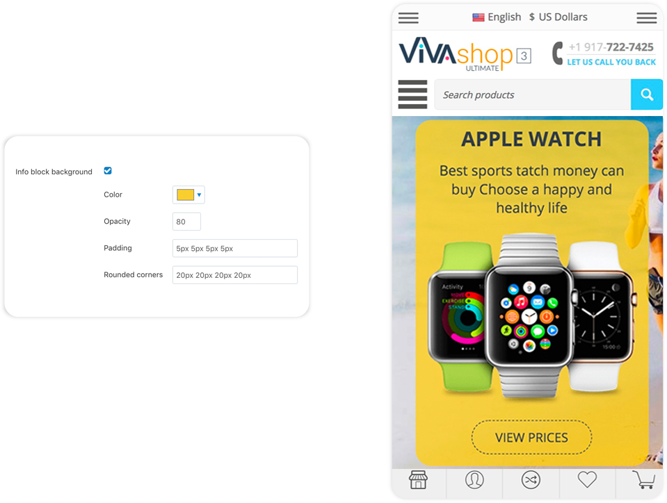
So, if you choose to add a background to your Info Block, firstly check the “Info block background” option. Then, you will have the following options:
- Color - From the color picker choose the color for your Info Block background (we used a yellow color for the background)
- Opacity - Enter the desired opacity level, in percentages (we used 80% in this example)
- Padding - Paddings are used to generate space around an element's content, inside of any defined borders. In our case, the element is the Info Block text and the borders are defined by the Info Block background borders. Paddings create space around the Info Block text accordingly. For example, if you set a padding to the left of the Info Block text, there will be a space created to the left of the Info Block text, and the Info Block text will move to the right. The more padding to the left, the more the Info Block text will move to the right. The setting format is similar to margins, “TTpx RRpx BBpx LLpx”, where “TT” is the size of the padding top (space is created on top, so Info Block text is pushed to the bottom), “RR” is the size of the padding right (space is created on the right, so the Info Block text is pushed to the left), “BB” is the size of the padding bottom (space is created at the bottom, so the Info Block text is pushed up), and “LL” is the size of the padding left (space is created on the left, so Info Block text is pushed to the right). All of these values can be set in percentages as well, the percent value representing a percent of the Info Block container. The values that we have set for the “Info Block cv background” in the example above are “20px 30px 20px 30px”, meaning that, we have created a space of 20px above and below the Info Block text, and 30px to the right and to the left of the Info Block text, inside the Info Block text background.
- Rounded corners - Set the corners for your Info Block text background. The setting format is same as margins and paddings, meaning “TLpx TRpx BRpx BLpx”, where “TL” is the value for the top left corner, “TR” is the value for the top right corner , “BR” is the value for the bottom right corner, and “BL” is the value for the bottom left corner. These values are in pixels. In the above example we have used “30px 0px 30px 0px”, meaning that the top left and bottom right of the background have a radius of 30px, whereas the top right and bottom left corners do not have any roundness at all.